Welcome to InKing Royalty’s November Blog Hop! During this year’s blog hops, we are enjoying a year of celebrations. This month’s projects celebrate Christmas, which – believe it or not – is just around the corner. Please prepare yourself for lots of beautiful projects that share the joy of this holiday. We are excited to share our creations with you today! After you read my post, I hope you’ll hop over to the next person on the list at the base of this post.
A friend asked me to make her teenage niece a cute Christmas card. Snowmen are cute, right? I used the Snowman Season photopolymer stamp set. I’ve been looking at it for a year and finally ordered it a couple of months ago. I am so glad I did! I made this card using the Fab Friday #201 sketch for the layout.
Here’s my card:
That happy dancing snowman is too cute! I used a Night of Navy/Seaside Spray color scheme with a bit of foil to keep the card from appearing too cutesy.
Here’s the Fab Friday 201 banner for this challenge:
Supplies and Measurements:
The Seaside Spray base of the card measures 5-1/2 inches by 8-1/2 inches, scored at 4-1/4 inches.
I used a piece of the Night of Navy 6 x 6 inch DSP for the background mat, and trimmed it to 4-1/8 inches by 5-3/8 inches.
Next, I ran a piece of Seaside Spray cardstock through the Big Shot using the brick and mortar 3D embossing folder. Then, I cropped it using one of the stitched rectangle dies. The final panel measures 3-3/4 inches x 5-1/8 inches.
I used multipurpose liquid adhesive on both the Night of Navy DSP and the brick embossed Seaside Spray cardstock to adhere them to the card base. This is my favorite adhesive, and I may or may not be hoarding it so I don’t run out. I have 3 containers in the jar on my desk and 18 in my adhesive drawer. I got down to three containers before and will never let myself get that low again. Strange – I will let my car run as low on gas as possible before refilling it. However, adhesive? I’m all about buying that when I get down to a dozen containers. Go figure………..
The foil is the reverse side of a scrap piece of the Frost DSP. It measures 3-1/4 inches long and wide enough to attach on the back of the white panel.
The white cardstock for the front was trimmed to 3-3/4 inches by 2-1/2 inches. While I had the white cardstock out, I trimmed a piece to 4 inches by 5-1/4 inches for the inside.
Snowman and Snowflake Fun!
I didn’t want a plain white space background for the snowman/sentiment panel. Therefore, I used the snowflake stamp from Snowman Season and my Seaside Spray ink pad. Since I wanted subtle snowflakes, I stamped it off once, then stamped twice on the white cardstock. The varying snowflake colors add depth to the white cardstock. I didn’t want snowflakes behind the snowman, and made sure I didn’t stamp where I planned on placing the snowman.
Both the snowman and the sentiment were stamped in Night of Navy. I used the light Pumpkin Pie blend for the carrot nose. That little pop of orange just completely works for a teenager card.
I used the light Seaside Spray blend to color in the snowman. Then, I used the color lifter blend three or four times to life off almost all of the color. When using the color lifter, make sure you let it dry completely before adding more.
The card really needed some ribbon. However, the beautiful Seaside Spray ribbon wasn’t wide enough and has a sophisticated feel. I didn’t want to add another color to the card, so I used the light Seaside Spray blend and colored the polka dot tulle ribbon. After wrapping the ribbon around the foil and white cardstock piece, I tied it in a square knot. It came out just like I saw it in my head.
I stamped a non-symmetric snowflake frame around the inside white cardstock panel. Then I stamped Merry Christmas in Night of Navy in the center of the inside.
Finally, I added a strip of the foil DSP and a piece of the Night of Navy DSP to the envelope flap. With that, I’d finished this coordinated card/envelope set.
I Just Had a Thought I Must Try SOON!
Sitting here typing this, I thought how cute would this be if I made the white piece into a shaker card using the Stampin’ Up! clear envelopes. If this post didn’t need to go live early in the morning, I would start the shaker right now! Stay tuned for those results.
Thank you for stopping by today. I hope you’ll hop along to the next stop on the blog hop,Joanne Brown at The Inky Dragon . There’s lots of inspiration to be found in this group – and you don’t want to miss it!
Have a Peachy Day!
Sue
Thank you for hopping along with us. If you get stuck during the Blog Hop, please use this line-up as a guide:
Do you live in the U.S. and need a demonstrator? If so, I’d love to talk to you!
Of course you do! Even more so because you are now moving on to create Thanksgiving and holiday cards, right? There’s more information about the August – December 2020 mini-catalog below!
If you are ordering less than $150.00, please use the host code shown. If you are ordering more than $150.00, please contact me first so you can get your stamping rewards! Any order over $50 will earn a little surprise from me.
The HOST CODE for NOVEMBER is CBDP2DQT.
This absolutely gorgeous bundle is now available! I already have one of the bundles and used it this past weekend. You can see that card here.
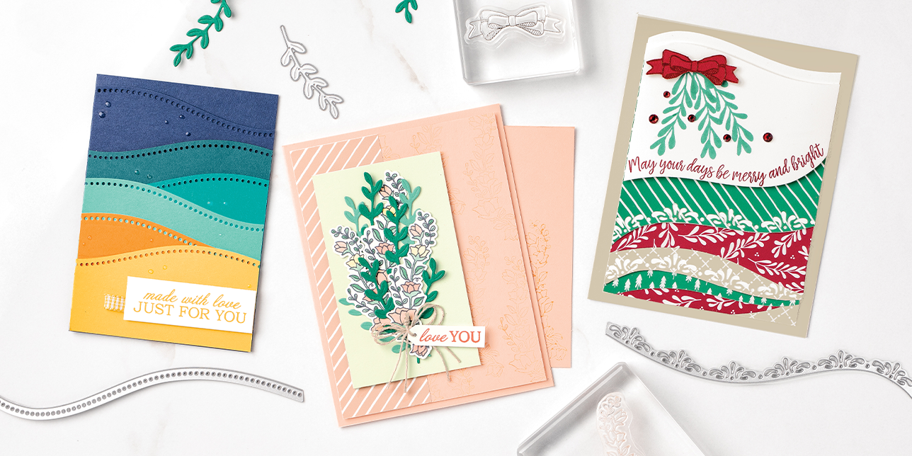
Here are some fabulous images from Stampin’ Up! Each bundle is available separately, but if you want it all, the whole variety bundle is pictured below:
158396 – QUITE CURVY VARIETY BUNDLE
Just look at this December Paper Pumpkin sneak peek! How awesome is this?!?!
Again, thank you for stopping by my blog today! I love to read and respond to your comments. I greatly appreciate your time.
I’m sure that, for so many of us, the weeks are just flying by. Aren’t there days when you just don’t want to wear a mask for another whole day? I know there are for me. I’ve realized something in the past week or so: teachers rely heavily on lip-reading, and masks just complicate things exponentially.
Anyway, the theme for Cardz 4 Guyz #255 is to create a clean and simple card. Sometimes that’s easier said than done. I started going through the blogs of various challenges looking for inspiration to hit, and I found it in the sketch challenge for CAS(E) This Sketch #392 and the colors for Fab Friday 198.
Here’s my CAS masculine card for the C4G design team and the two other inspiration challenges:
Here are the challenge banners:
CAS is the Key for This Week
I really had to hold myself back from running the front of the Gray Granite base through the Subtle embossing folder. The only thing that held me in check was that I knew I already had enough dimension since I popped up the focal banner on dimensionals as well as the sentiment.
Measurements and Embossing
The base is a standard A2 card, so it measures 5-1/2 inches by 8-1/5 inches, scored at 4-1/4 inches.
I trimmed a piece of Misty Moonlight to 4-1/4 inches by 3 inches to use it as the base of the focal image.
Next, I trimmed the Bumblebee cardstock to 4-1/8 inches by 2-7/8 inches for the middle mat. This seemed about the best way to incorporate the Bumbleebee color in my CAS masculine card.
The top Seaside Spray cardstock measures 4-1/8 inches by 2-3/4 inches.
I used a piece of scrap white cardstock for the sentiment and punched it out with the classic label punch.
While I had the white cardstock out, I trimmed a piece for the inside of the card to 4 inches by 5-1/4 inches.
Rooted in Nature
Rooted in Nature seemed to go along with the sketch from CTS, and the tree, inside and outside sentiments come from that set.
After carefully figuring out placement of the Misty Moonlight ribbon and the sentiment, I decided where the tree needed to be stamped.
Let the trial and error begin …
I knew I needed to use the Stamp-aratus, and that turned out to be the best decision while creating this card. After rubbing the cardstock with my embossing buddy, I stamped the tree using VersaMark three times.
Next, I covered the image with Smoky Slate embossing powder and then heat set it. That’s when I realized there wasn’t enough of a contrast between the Smoky Slate embossing powder and the Seaside Spray.
When at First You Don’t Succeed…….
Back to the Stamp-aratus for the next try. Again, thankfully I used it so I could easily line up the cardstock in the proper position. Don’t forget to use the embossing buddy now as well. This time I stamped the tree in Smoky Slate right on top of the heat set embossing powder. I did that four or five times trying to get some contrast to show up. Then, I covered the image with clear embossing powder and heat set the image again.
While there are places on the tree where the Smoky Slate shows through for some added depth, I still wasn’t really happy. I grabbed the Smoky Slate marker and started coloring over the tree. Imagine my delight when I realized that the marker added another element of depth by filling in all the negative space in the tree. I liked the effect so much, I outlined the whole tree with the marker as well.
Then, I placed a piece of the Misty Moonlight ribbon on the front. I secured the ends on the back of the focal panel using glue dots.
After placing dimensionals on the back of the focal panel and the sentiment, I put everything together.
The inside sentiment, again from Rooted in Nature, simply says “to thank you for all you do”.
With that, I’d finished this card for the Cardz 4 Guyz CAS design team, and the two challenges.
Thank you so much for stopping by today. Have a wonderful week. I can’t wait to see your CAS masculine cards on our challenge page!
I’d also love to hear what you think, and greatly appreciate every comment.
If you LOVE DSP and love to buy it, the special this month is just for you!
Here’s the DSP that’s included in the 15% off sale!
ARTISTRY BLOOMS DESIGNER SERIES PAPER TIS THE SEASON 6″ X 6″ (15.2 X 15.2 CM) DESIGNER SERIES PAPER
FOREVER GREENERY DESIGNER SERIES PAPER
POINSETTIA PLACE DESIGNER SERIES PAPER
TRIMMING THE TOWN DESIGNER SERIES PAPER
PLAID TIDINGS 6″ X 6″ (15.2 X 15.2 CM) DESIGNER SERIES PAPER
TOILE TIDINGS DESIGNER SERIES PAPER
PEONY GARDEN DESIGNERS SERIES PAPER
WHALE OF A TIME 6″ X 6″ (15.2 X 15.2 CM) DESIGNER SERIES PAPER
HEARTWARMING HUGS DESIGNER SERIES PAPER
MAGIC IN THIS NIGHT DESIGNER SERIES PAPER
SNOWFLAKE SPLENDOR DESIGNER SERIES PAPER
IN GOOD TASTE DESIGNER SERIES PAPER
PLAYING WITH PATTERNS 6″ X 6″ (15.2 X 15.2 CM) DESIGNER SERIES PAPER
PLAYFUL PETS DESIGNER SERIES PAPER
Do You Want to Place an Order?
Of course you do! Even more so because of the DSP sale, right?
If you are ordering less than $150.00, please use the host code shown. If you are ordering more than $150.00, please contact me first so you can get your stamping rewards!
The HOST CODE for OCTOBER is CBDP2DQT.
Again, thank you for stopping by my blog today! I appreciate your time.
The biweekly Fab Friday challenges really hold a special place in my heart. About four summers ago, one of my cards recieved an honorable mention from Fab Friday. I felt so honored, and kept the card I’d created. If you’ve used Stampin’ Up! products for a few years, I think you will remember the Party Panda stamp set and the Pick-a-Pattern DSP. I paired those two products for a clean card and am still just tickled when I think about it, or look at the card. So, I try to play along with as many Fab Friday challenges as possible, and this one is no different.
The four colors in the FabFri194 challenge are Bermuda Bay, Daffodil Delight, Pumpkin Pie, and Poppy Parade. What a fun color combination! I decided to create two different cards: the first could very well be considered a #simplestamping card. When my DH saw the card, he said the card looked very simple, which made me happy because it meant I succeeded.
When I created the second card, I did a lot more stamping, and added other embellishments to create a bigger statement with my card. However, I still had quite a lot of white space on the card.
Here are my cards:
Here’s the challenge banner:
I chose Forever Fern mainly because I thought the different stamps would create a pretty unique split card technique.
Similarities
Both cards have a Pumpkin Pie base measuring 5-1/2 inches by 8-1/2 inches, scored at 4-1/4. Use your bone folder to go over the fold created.
The white cardstock is the background for each card. The #simplestamping card measures 4-1/8 inches by 5-3/8 inches. The not-so-simple card measures 4 inches by 5-1/4 inches.
OPTIONAL: After stamping the front of the #simplestamping card, I decided it needed something. Therefore, I used the scoring blade on my paper trimmer and made three vertical score lines down the left side of the card. I scored at 3/8 inch, 1/2 inch, and 1 inch. You can score wherever you like, but I would recommend the last score line stay at 1 inch for the balance of the card. I scored after I finished my stamping so the score lines are subtle. If you want more noticeable vertical lines, score before you stamp. This will create the empty spaces as shown on a scrap sample below:
The card on the left was scored after stamping. The card on the right was scored before stamping.
I used the same colors for the different stamps on both complete cards I created. The colors on the left in the scoring samples reflects the color/stamp combination I used. However, you can use whatever colors float your boat, so to speak.
The inside of both cards have more of the quad of colors stamped on the left and bottom. However, the #simplestamping card inside is simpler as well.
I used the same stamp set, Peaceful Moments, for all the sentiments, both of which are popped up on dimensionals.
In addition to stamping the card fronts, I also stamped the bottom, left-hand corners of both envelopes and across the envelope flaps.
Differences
I added a Bermuda Bay mat to the not-so-simple mat. It measures 5-3/8 inches by 4-1/8 inches.
Obviously, I stamped more on the not-so-simple card. Since I wanted the bold sentiment block kind of snuggled down into the stamping, I made sure to come down the left, across the bottom, and about 1/4 of the way up the right side.
The sentiment on this card comes from Peaceful Moments. I stamped it in Bermuda Bay on white cardstock. I cropped the sentiment using a stitched rectangle die. Next, I cropped a Stitched So Sweetly mat for the greeting. It will be our secret that I cropped it from the Bermuda Bay mat under the white cardstock.
Using Bermuda Bay, I stamped Happy Birthday, on the inside of the not-so-simple card.
The #simplestamping card’s sentiment is much more simple. I used the birthday sentiment,, stamped it in Momento Tuxedo Black, and cropped it using a stitched rectangle die.
Anchors and Embellishments
Because of the placement of this sentiment, and to add some interest, I added Poppy Parade and Daffodil Delight to the bottom of the sentiment panel. I really amazed myself that I stamped the Poppy Parade just about perfectly. Complete happy accident, but it anchored the sentiment on the card.
I placed three elegant faceted dots on both cards. The #simplestamping card got three of the white dots, which add a bit of sparkle.
I wanted to have more of an impact with the dots on the not-so-simple card. Therefore, I grabbed my dark Bermuda Bay blend and colored each, let them dry, colored another layer, repeat, repeat.
This card also needed something to anchor the sentiment. Since I just wanted a subtle ribbon I grabbed one of my all-time favorite ribbon: the polka dot tulle ribbon. I simply wrapped it around the white cardstock/Bermuda Bay mat, and tied it in a square knot. The subtle ribbon presence seemed perfect to me.
Finally, I assembled all the pieces of the cards. Since I’d already stamped the front and flap of the envelopes, I had finished both of these coordinated card sets.
As always, thank you so much for stopping by my blog today. I’d also love to hear what you think, and greatly appreciate every comment.
Guess what’s going on Now, but only for a few more days!
Bonus Days! Earn a $5 coupon for every $50 in product for the month of July. Spend your coupons in August!
The new mini-catalog goes live in August! Coupons and new products; a match made in heaven!
Do You Want to Place an Order?
Of course you do! Even more so because of the products in the NEW catalog. This NEW catalog is FABULOUS!! Wait until you see the new MINI-CATALOG!! Stay tuned for sneak peeks of those items!
If you are ordering less than $150.00, please use the host code shown below. If you are ordering more than $150.00, please contact me first so you can get your stamping rewards! I want YOU to get the stamping rewards you earn for your order over $150.00
Any order over $50 will earn a gift from me and an August – December mini-catalog. Just take a look at the gorgeousness of this cover:
Even though I can’t show you the inside pages until August 4th, I can show you sneak peeks!
The HOST CODE for JULY is K6NND3UU.
Again, thank you for stopping by my blog today! I appreciate your time, and enjoy reading, and responding to, comments.
Someone with whom I have worked for the last 17 years or so has decided to leave our community. Therefore, I needed to create a card with enough room on which my group chat members can write. Since our school colors are black and gold, and our mascot is hornets, the Golden Honey suite is perfect. I purposely kept this SAB suite from because it matches our community so well.
In order to create what I needed to accomplish, I flipped the Fab Friday #193 sketch and did a mirror image. I hope you can see the sketch in my fun fold card below:
Here’s the challenge banner:
Things I Know for Sure…..
If I had to pick a product that was very important while creating this card, I would put repositionable/temporary tape. It is much, much easier to dry-fit a card with all these pieces and flaps using the removable tape. Moving things around and trying out ideas wasn’t as difficult as it could have been. The removable tape really, really helped when trying to figure out the best placement for the ribbon pieces. When it came time to permanently adhere the pieces using liquid adhesive or dimensionals it no longer mattered where I’d used this tape. If any of the removable tape does show, a rubber adhesive eraser works like a charm!
Another thing I know for sure is that I know that it would be extremely confusing to try to explain the pieces and the cuts I made. Therefore, I cut out a second set of everything, wrote down the measurements for each piece, then took pictures.
Here are the main cuts and score lines I made:
So much easier to do it this way. Now, I feel like I can explain my final process! You really don’t need to know my trials and errors. Again, the removable tape is your friend.
Basic Directions for the Fun Fold Card.
I wanted the gold/black hexagon pattern DSP to stand out against the black cardstock base. Therefore, I used the Delicata golden glitz ink pad and tapped each side into the ink. This ink is very delicate, so I needed to tap, tap, tap the ink, let it dry, and repeat the process until I achieved the look I wanted. HINT: don’t adhere this DSP to the cardstock yet.
Next, I used some tear-and-tape to adhere the flap to the inside of the card. If you put the score line directly at the edge of the cardstock, the flap won’t close properly.
Then I adhered the two pieces of 4-1/8″ by 5-3/8″ of white cardstock to the inside of the card.
From my dry-fitting, I knew that the front of the hexagon DSP looked like something was missing when the first flap opened. Since I knew that the whole stitched nested label would not fit under my flap, I played around with the placement. I decided I liked the way the left triangle of the label shows when the flap is closed, so that’s what I did.
The front of the flap was next. I wanted a dark sentiment for which I could use clear embossing powder. My Stamp-aratus allowed me to stamp the sentiment in black multiple times without a problem. When I was happy with the sentiment, and while waiting for the black ink to dry, I cleaned off the stamp (don’t remove it from the acrylic). After the black ink dried, I used my embossing buddy to clean the cardstock then restamped the sentiment twice using VersaMark. I carefully spooned clear embossing powder over the sentiment, then set it with my heat tool. I’ve found that the embossing results are much better if I use my Stamp-aratus for the sentiment because I can stamp it multiple times with the VersaMark.
For the front sentiment panel, I used dimensionals under the sentiment and the bee.
Time for the ribbon. I strongly suggest using tear-and-tape to adhere your ribbon in place because it will get a workout opening and closing this card. The point in the gold foil nested label gave me a good starting place for the ribbon. Using an 8′ piece of ribbon, I adhered 4″ of it to the base of the card. Now I could adhere the hexagon DSP to the base of the card, and over the ribbon.
Next, I cut a 7″ piece of ribbon and used tear-and-tape to adhere 3″ of it to the back of the cardstock sentiment panel. Then, I put dimensionals under the black cardstock panel but over the ribbon. This way, the ribbon is securely attached and the black cardstock piece isn’t sitting directly on the flap.
Now, the card is ready for your embellishments, depending on your desired outcome.
Finally, I adhered a coordinating piece of DSP to the envelope flap and trimmed it down. I also added a beehive and small bee to the front, bottom, left-hand corner of the envelope.
Your Turn…..
While the directions appear to be lengthy, the whole process for this card took me about an hour. I spent the majority of that time figuring out the logistics of the card. Now that I have the measurements and process all figured out and written down, creating another card like this will be a piece of cake.
I hope you try to create your own fun fold flap card! I’d love to see your results, so include a picture or two in the comment section below. Happy, cutting, cropping, stamping and adhering!
As always, thank you so much for stopping by my blog today. I’d also love to hear what you think, and greatly appreciate every comment.
I’m now on Instagram for just my SU! creations! Finally, right? Follow me at @justpeachystamping or scan the photo below:
Guess What’s Going On Now!
Bonus Days! Earn a $5 coupon for every $50 in product for the month of July.
Do You Want to Place an Order?
Of course you do! Even more so because of the products in the NEW catalog. This NEW catalog is FABULOUS!! Wait until you see the new MINI-CATALOG!! Stay tuned for sneak peeks of those items! I’ll be using some new mini-catalog items for the InKing Royalty blog hop on Wednesday!
If you are ordering less than $150.00, please use the host code shown. If you are ordering more than $150.00, please contact me first so you can get your stamping rewards! Any order over $50 will earn a gift from me.
The HOST CODE for JULY is K6NND3UU.
Again, thank you for stopping by my blog today! I appreciate your time.
This week, Stampin’ Up! surprised their demonstrators with a PDF set of COVID-19 sentiments. I immediately used them to create cards to send to my family. This sentiment is perfect for us because, like so many other people, we have been sharing locations with tp. When we find some, we pick up as much as allowed in order to share with other family members.
Since I incorporated two different color challenges, I used one sets of colors for five cards and another set for the other five. The layout is from a sketch challenge, but I missed the deadline for that.
I am having a terrible technical time with this post tonight. Hopefully, I will be able to post the challenge banners here instead of after my card.
Here are my cards:
Using What I Had Before It Retires
It’s pretty easy to see which card matches which color challenge. For each of the challenges, I used 6 x 6 DSP from the various color families. The mats used Bermuda Bay or Rich Razzleberry. Thankfully, I had retired ribbon in Bermuda Bay and Melon Mambo. In order to create a frame around the 6 x 6 DSP pieces, I used Basic Black mats.
When I printed the sentiments, I printed enough of the particular page with the tp sentiment. Isn’t it perfect?
The inside sentiment is shown below:
Cute! Appropriate, right?
When making multiple cards , I’ve found it much easier to do each element and then assembly line the card together. Therefore, I had little piles of DSP strips, sentiments cropped, ribbons,base cardstock, and black mats all cut out. I even had the dimensionals on the back of the sentiments done and they had their own pile. This allowed me to create the cards in chunks throughout my virtual teaching day in 5 minute breaks over two days. Easy Peasy really and truly.
What About the Greats?
After I had written and addressed all the cards, I thought I needed to send a card to each of my great-nieces and great-nephew.
Here are those cards:
As always, thank you so much for stopping by my blog today. I’d love to hear what you think, and greatly appreciate every comment.
Please stay safe, healthy, and isolated as much as possible. I miss my high school kids and the relationships we’ve formed. My heart breaks for my seniors. But, by working together and following the CDC guidelines, we can all help to flatten the curve.
Of course you are! Even more so because of the products in the mini-catalog and the Sale-a-Bration FREE items! The HOST CODE for MAY is WW6HSM6A. If you are ordering less than $150.00, please use the host code shown. If you are ordering more than $150.00, please contact me first so you can get your stamping rewards!
Remember, any order over $50 qualifies for a FREE gift from me AND a free catalog for the 2020 – 2021 calendar year! I’ve seen it, it is fabulous, and I am anxiously awaiting its arrival!
Ask me how you can see it NOW as well!
Again, thank you for stopping by my blog today! I appreciate your time.
I love the Golden Honey DSP and Honey Bee bundle so very much that I just had to get another FREE set of the DSP (with a qualifying order) from Sale-a-Bration! While I love every, single pattern of the DSP, the flower pattern is quickly becoming one of my favorites. I’ve already posted one card using this pattern and Bermuda Bay. You can see that card here. Today’s color combination is black, white, and Poppy Parade.
Here’s the FabFri181 challenge banner:
Here’s the card I created for this challenge:
This DSP is Just Gorgeous!
I started out coloring these flowers with Purple Posy, but decided I wanted a bolder look. Since I’d already colored a blue shade, I went with this Poppy Parade. I really like the way the poppy color plays off the black and white background of the DSP. I didn’t even try to use my blends to color. Instead, I grabbed my Poppy Parade marker, relaxed, and got started. While I colored these flowers, I was turning card options over and over in my head. By the time I finished coloring, I had my layout picture firmly in my brain.
Covering up even a small part of the DSP didn’t seem like a good idea, but I needed a vertical banner of some sort. I grabbed a piece of Whisper White, ran it through the Subtle 3D embossing folder, trimmed down the banner and fussy cut the chevron on the bottom. Finally, I outlined it with my Basic Black Stampin’ Write marker.
Next, I needed to cut down the DSP for the top part of the card and the strips. I wanted to make sure I had a definitive border between the DSP and the Poppy Parade cardstock, so I outlined the DSP with my Basic Black marker as well.
Finishing Up the Card
I cropped the strips and the cardstock mats using the Stitched Rectangle die set. While the challenge banner called for five horizontal elements, I only used four. I knew I needed ribbon of some sort and decided to use the Basic Black baker’s twine tied in a bow at the top of the banner. Wouldn’t it be fabulous if baker’s twine came in every color? I can’t be the only one wishing for that, can I?
Next, I needed to decide how to adhere everything. I used some large glue dots to adhere the banner. The large ones enabled the banner to have just a smidge of a pop-up. I used the multipurpose adhesive for the top three strips. Dimensionals give the sentiment strip a pop-up. There are dimensionals under the cardstock and between the sentiment and the cardstock. This dimension makes the sentiment pop off the banner creating a focal point.
Finally, I stamped some flowers on the front, bottom, left corner of the envelope and added a piece of the Brights DSP to the envelope flap.
With that, another Golden Honey DSP card and coordinating envelope was complete. Contrary to the name, there’s not even a tiny bit of golden color on this card.
As always,
Thank you so very much for stopping by my blog today. I appreciate your the time you take to read, and comment, on my blog.
Contemplating placing an order today? Of course you are, especially because the Sale-a-Bration items are must haves! If you don’t already have a Stampin’ Up! demonstrator, I would be honored to work with you. Please contact me or visit my shop to order the supplies for this card.
If you are ordering $150 or more, please contact me first so you earn all the Stamping Rewards for your order. Stamping Rewards = FREE PRODUCT!
If you are ordering less than $150, please use the host code, DANAAUNT, when prompted. I use the combined rewards for gifts for customers.
Just look at these amazing products:
Contact me to sign up for Paper Pumpkin, or use this link: https://www.paperpumpkin.com/en-us/sign-up/?demoid=2155072
Welcome to Just Peachy Stamping by Sue Jackson: an independent Stampin' Up demonstrator.
Through Stampin' Up!, I happily share my love of papercrafting through sales, classes, small stamping group meet-ups and workshops. I think that being a teacher in my "real life", I have a unique approach to sharing my fantastic hobby. I look forward to connecting with you!