It’s always fun to play along with Fab Friday and CAS(E) This Sketch. When a color challenge and a sketch challenge can be combined into one adorable card it’s a winner.
Here are the FF180 and CTS#354 challenge banners:
Just a thought – I wish I could figure out how to post side-by-side pictures with this updated version of WordPress. Just saying.
Here’s my card:
Cuteness Overload!
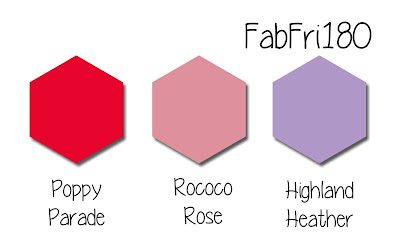
When I first saw the Fab Friday color combination, I had a difficult time figuring out how to incorporate the Rococo Rose. I had my A-ha moment when I decided to combine Fab Friday with CAS(E) This Sketch! The In Color DSP for the 2019 – 2021 colors would give me the perfect strip of Rococo Rose, satisfying both challenges.
Since I knew from the start that I wanted to use the Little Ladybug cling stamp set, which is the host set Sale-a-Bration! Adorable! The large flower fit the focal panel perfectly. I just felt the need to add a ladybug tucked under the sentiment. All three stamps came from the one stamp set. So stinking cute!
I used Stamping Blends combos to do all the coloring. The stem and leaves are in Granny Apple Green, which I know is not in the color challenge. However, I couldn’t figure out how to use the three given colors in the leaves. I thought Granny Apple Green would be light and bright enough for my planned card.
Both the flower petals and the ladybug were colored with the Poppy Parade Stamping Blends. I used the Petal Pink Blends combination for the center of the flower and the face and arm, and leg on the ladybug. This bright red really pops off the Whisper White. Highland Heather provides a colorful backdrop. Doesn’t this color combination remind you of Valentine’s Day conversation hearts?
I stamped the sentiment in VersaMark on Poppy Parade cardstock, then used white embossing powder. The embossed sentiment exceded my expectations!
Adding a Bit of Texture
The Whisper White panels for the stamped images needed to have just a bit of texture. Therefore, I cropped the large white panel and the sentiment strip using the Stitched Rectangle dies. I cropped the cute as a bug ladybug using the Stitched Shapes die set. My next usual step is to use Stamping Markers to outline the stitches in the ditch, but I wanted to keep this card clean.
Finally, I ran the the background white panel through my Big Shot using the Subtle 3D embossing folder.
Putting It Together
Since I had the CTS sketch to guide me, I just lined up all my pieces in the appropriate places. I did a dry-fit for the sentiment and the ladybug, and thought I needed to find some way to ground and connect the flower, ladybug, and sentiment. Ribbon seemed to be the easiest way to pull everything together. I used the Poppy Parade textured weave ribbon tied in a simple square knot.
The sentiment and ladybug are popped up on dimensionals. I used glue dots under the knot of the ribbon, and as an anchor on the back of the base. I adhered all the other elements using the TomBow liquid adhesive.
To finish off the envelope, I put a piece of the In Color DSP on the envelope flap. I couldn’t resist using the line-up of little ladybugs on the bottom of the front of the card. Do you notice anything different about this line of ladybugs? Don’t tell anyone, but I stamped the first four ladybugs upside down. In order to make that feel purposely done, I stamped the middle set right side up, and the last set upside down.
As always,
Thank you so very much for stopping by my blog today. I appreciate your the time you take to read, and comment, on my blog.
Have a Peachy Day!
Sue
Sale-a-Bration is Here!
Contemplating placing an order today? Of course you are, especially because the Sale-a-Bration items are must haves! If you don’t already have a Stampin’ Up! demonstrator, I would be honored to work with you. Please contact me or visit my shop to order the supplies for this card.
If you are ordering $150 or more, please contact me first so you earn all the Stamping Rewards for your order. Stamping Rewards = FREE PRODUCT!
If you are ordering less than $150, please use the host code, DANAAUNT, when prompted. I use the combined rewards for gifts for customers.
At first glance, Pumpkin Pie and Melon Mambo on the challenge banner appear bright and almost as if the brightness with these two colors will clash. Since Basic Black gives the eyes some place to rest, it fits with these colors very well.
However, it soon becomes apparent that this is a fabulous color combination with loads of potential!
Here’s the challenge banner:
Here’s the birthday card I created:
The Stamparatus is the Star for this Card
I already had all the pieces cut and happily residing in my “scrap” 8×8 page protectors, one for each SU color of course. I even found the much punched out (6 circles are punched in the paper) bottom Basic Black layer in one of the “scrap” page protectors. The Whisper White frame came from the white “scrap” page protector already cropped to size. My only real dilemma was to figure out what to do with all the pieces.
I decided to try to create a birthday card using these colors because I thought they would just create a fun, happy card.The sentiment fitting inside the frame also steered me to a birthday card, so I decided to use the Amazing Life photopolymer stamp set for everything on the front. I needed to figure out how to get the sentiment perfectly dark enough since I’d previously run the Melon Mambo through the Big Shot using the Subtle embossing folder, . Enter the wonder tool, the Stamparatus!
Truly, this tool needs to be on your must have list if you don’t already have it. It’s so wonderfully easy to get beautiful results no matter how many times an item needs to be stamped. In this case, I lined up what I needed, picked up the sentiment stamp, and then stamped and reinked three times. The result is a perfectly dark, legible sentiment. Who wouldn’t love that?!?
Next, I lined up the birthday cake on the frame. I decided to use the Stamparatus again just in case it needed to be restamped. I was daring and stamped “Happy Birthday” straight onto the frame. Instead of using the blends to color the decorations on each layer, I used the blunt end of the Stamping Write markers.. I simply alternated the colors on the layers, including the candle and flame.
Finishing Touches
After stamping and coloring, I just needed to assemble the pieces. I decided I really wanted a clean birthday card and just let the stamps and colors do all the work. I used the Picture Perfect stamp set to stamp “happiest of birthdays to you” and confetti in Pumpkin Pie and Melon Mambo on the inside. With that, I’d finished the card.
As always, I created a coordinating envelope by using a piece of the Melon Mambo DSP from the 6×6 Brights Collection.
With that, I’d finished my card and coordinating envelope. Easy peasy! Very, very easy peasy!
I hope you find inspiration in this color challenge as well. It closes on 10.24.2019, so pop on over to http://fabfridaystampinchallenge.blogspot.com/, see the design team’s cards and all the entries. I’d love to see what you create!
Thanks so much for stopping by my blog today. A big thanks, in advance, for taking the time to leave a comment.
Have a Peachy Day!
Sue
If you don’t already have a Stampin’ Up! demonstrator, I would be honored to work with you. Please contact me or visit my shop to order the supplies for this card.
If you are ordering $150 or more, please contact me first so you earn all the Stamping Rewards for your order.
If you are ordering less than $150, please use the host code, 49KJF94R when prompted. I use the combined rewards for gifts for customers.
Supplies
Brights DSP, item # 149613
Amazing Life stamp set, item # 148750
Everything Festive stamp set, item # 150566
Stamparatus, item # 146276
Whisper White cardstock, item # 100730
Melong Mambo cardstock, item # 115320
Pumpkin Pie cardstock, item # 105117
Stitched Rectangles die set, item # 148551
Subtle 3D embossing folder, item # 151775
Memento Tuxedo Black stamp pad, item # 149617
Medium Whisper White envelopes, item # 107301132708
Tombow Liquid Adhesive (my fav!!), item # 110755
Paper Pumpkin Specials
I am super excited about the October and November Paper Pumpkin coordinating kits! I recieved the shipment notification email for my October kit today. It’s on it’s way!! One kit is for cards, the other for coordinating gift tags. So excited! In order to recieve the November kit, you will need to sign up by November 10th. Here’s the link for you to sign up for these kits as well: https://www.paperpumpkin.com/en-us/sign-up/?demoid=2155072
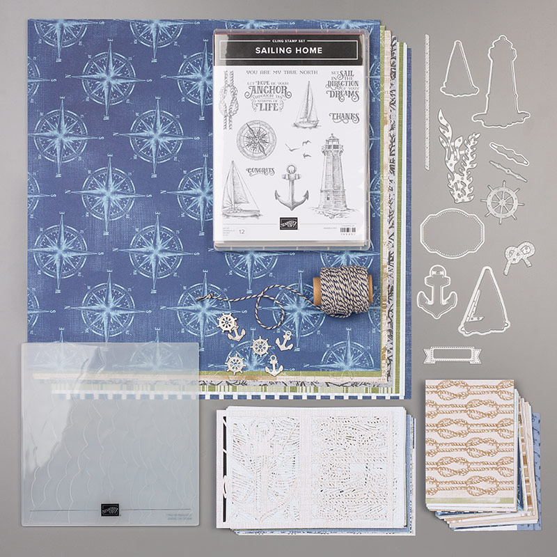
Each product in the Sailing Home suite works together to create stunning nautical cards for unisex cards. I used just a few pieces of the dies, two pieces of DSP, the Crumb Cake and Night of Navy baker’s twine, Night of Navy and Crumb Cake cardstock, some ink, and a Sailing Home trinket for the FabFri169 challenge. This clean and simple card came together very quickly, and would be easily replicated for mass production.
Here’s the challenge banner from Fab Friday:
This simple sketch lends itself to a multitude of interpretations. Here’s the card I created:
A Simple Process
Night of Navy cardstock provides the base, with the first pattern of DSP for the background. I used the Layering Circle die set to crop the compass from another piece of DSP. I especially like the size of the DSP compasses, which really worked for this sketch challenge.
Crumb Cake cardstock provided the base of the lighthouse. I stamped it with Night of Navy ink and cropped using the lighthouse die. I also used Night of Navy ink for the sentiment. This sentiment fits perfectly in the banner from Smooth Sailing dies. In order to add some depth to the sentiment banner, I outlined it using an Early Espressso marker. I still thought the sentiment needed additional dimension to stand out, so I used a Crumb Cake marker to color in the stitches in the ditch.
After adhering the DSP compass where I wanted it, I wrapped the baker’s twine around the base of the card three times and tied it in a square knot. Then I pulled a small length of the nylon thread which allowed me to attach the trinket to the square knot in the baker’s twine. The lighthouse and sentiment are popped up on dimensionals, as is the base to accomodate the baker’s twine.
Once again, I finished by decorating the envelope by stamping a lighthouse on the front left, and added more of the compass DSP on the flap.
Thank you for stopping by my blog today.
Have a Peachy day!
Supply List:
Sailing Home cling stamp set, item # 149457
Smooth Sailing die set, item # 149576
Baker’s Twine, item # 149483
Sail Away Trinkets, item # 149483
Whisper White cardstock, item # 100730
Night of Navy cardstock, item # 100867
Crumb Cake carstock, item # 120953
Night of Navy Ink, item # 147110
Neutrals Stampin’ Write markers, item # 147158
Dimensionals, items #104430
TomBow Multipurpose Liquid Glue, item # 110755
You Know You Want to …….
If you would like to order this fabulous bundle, item # 151066, today and live in the U.S. please CLICK HEREto be connected to my store. With just a few simple supplies, you, too, can create fabulous cards, and I would be honored to help you do so. Be sure to check out the Come Sail Away complete suite, item # 152175 to order every coordinating item with one click. The whole suite also includes the 10% discount for the bundle of the stamp set and dies. Score!
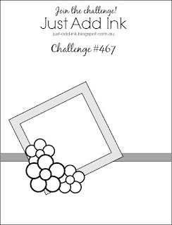
I love two-fers! Any time I can combine a color challenge (FabFriday168) and layout challenge (Just Add Ink #467), I am game.
Here are the banners for both challenges:
The Fab Friday colors are bright and happy and, to me at least, lend themselves to a whimsical card. Just Add Ink’s layout can be sophisticated, just as easily as it can be fun. I went with whimiscal and fun.
Here’s the inside and outside of my card:
Fab Friday Colors
In keeping with all my other blonde angels, I used the Pineapple Punch marker to color this angel’s hair. However, with just that one color, her hair looked very flat, so I pulled in Mango Melody to highlight her hair. I also used the Pineapple Punch DSP for the top 2/3 of the card.
Lovely Lipstick provided the color for the angel’s shoes and the enamel dots on her dress. I also used Lovely Lipstick DSP for the bottom third of the card.
I used Bermuda Bay in three somewhat subtle areas. First, I colored the dress using the blends combo. Second, I used the marker to color the stitching in the ditch created by the Stitched Shape dies. Finally, I pulled some retired ribbon to create a border between the two DSP pieces.
The final color, Pacific Point, provides the card base and the rotated mat for the angel.
Four colors accomplished. All the pieces were dry-fit and then attached using dimensionals and Tombow liquid glue.
Opinions
The four colors are pretty bright, but I really thought it worked all the way around. My DH and DD did not think so because they both thought the Pineapple Punch DSP on the top of the card was too bright. Did I mention that I had already adhered all the pieces?
In an effort to appease both of them, I decided that I would use a piece of vellum over the Pineapple Punch DSP to mellow it out. After some measuring, cropping, and very careful placement, I was able to get the vellum adhered behind the Pacific Point mat. At that point, I needed to figure out how to adhere at least the top corners of the vellum. I used the thin line glue to place a dot in each of the top corners and then covered the very small dots of glue with two more enamel dots from the Happiness Blooms dots.
I stamped the inside, decorated the front and flap of the envelope andshowed the new version of the card to my DH (dear husband) and DD (dear daughter). They both thought it looked “better”. I have to say, I agree that the more muted Pineapple Punch DSP helps to tone down all the bright colors.
Thank you very much for stopping by my blog today. I greatly appreciate your time.
Have a Peachy day!
Sue
If you live in the U.S. and are in need of a demonstrator, please CLICK HERE to be connected to my store. I would be honored to help you create cards from beginner levels, to casual, and to avid levels. Placing an order with me would also entitle you to a free copy of the Holiday Catalog being released the first week of September.
Just ONE more day to earn bonus coupons! $5 coupon for every $50 spent. I am really looking forward to spending my coupons on my holiday catalog pre-order!
Last week I played along with Just Add Ink’s color challenge #464 of Granny Apple Green, Soft Sea Foam, and Flirty Flamingo. You can see my card here. Imagine my complete surprise when, sitting at the airport, I saw the email update that I had won the challenge! I am so incredibly honored and, now that I am home, have added the widget to my blog.
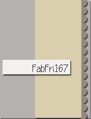
Fab Friday 167
Before I left for NY, I created a card for this challenge, but was not happy with it. After getting home, I needed to create thank you cards for some cousins we visited. Therefore, I decided to try creating a card for this challenge again. However, I had been looking at this newly created card since yesterday afternoon when I “finished” it. After trying a couple of additions, unsuccessfully I might add, I finally (!!) stumbled across an idea: black enamel dots leftover from Halloween. Finally, I feel finished!
Here’s the FabFriday167 sketch:
Here’s my card:
All the Elements
The border element should have been easy to figure out, but I had a difficult time deciding on it. I’d completely forgotten about the scalloped die in the Seasonal Layers die set. Therefore, I wound up using the Decorative Ribbon Punch (item 143721). This SAB DSP has really gotten a work out and I have one full sheet and then pieces left. There are multiple reasons I love this DSP. One of which is the ability to punch the large (inside) and small (outside) butterflies at once using the Butterfly Duet punch (item 148523).
The stamp from the recently retired All Things Thanks stamp set, fits perfectly when stamped vertically on the Everyday Label punch (item 144668). I like to mat this sentiment punch so, I punched a black one, cut it in half, and attached it so just a thin border shows on the top and bottom. Then, I used the Stamping Write marker to outline the sides of the Whisper White punch, and, ta-da, I’d completed the sentiment element, and finishing the card soon followed.
Thank you for stopping by today! I know your time is valuable, and I appreciate your visit to my blog.
If you live in the U.S., and would like to honor me with your Stampin’ Up! business, please click on the link at the top of my blog to visit my store’s page.
Fab Friday for this 2 week period is to use all 5 of the new In Colors for 2019 – 2021. Since I am off for the summer, I have been organizing and purging and came across painter’s tape. The tape reminded me of a technique I used a few years ago, and I thought it would work pretty darn well. The background mat for the card had to be Purple Posy since the ink and markers are not available yet.
Here’s my card and the challenge banner:
After that easy mat decision was made, I had to organize the remaining colors into the order of my stripes. I tried to get the colors a sunset kind of order, so the darkest is on the bottom and the lightest on the top. The order from bottom up is Pretty Peacock, Seaside Spray, Terracotta Tile, and Rococo Rose.
If at First You Don’t Succeed,
Try, try, and try again. The first time I tried “stamping” with the painter’s tape, it turned out way too dark. The stripes are very simple to create; simply take a length of painter’s tape and place it on the ink pad. At first, my result was too dark, as pictured below.
My second attempt was to not press the tape on the ink pad as hard as I had done the first time. However, that was still too dark. I finally wound up stamping off the tape before lining it up on the card. I really like the distressed look of the stripes, and can believe I got the stripes straight. Success!
Free as a Bird
I knew from the beginning that I wanted to use the birds on a branch for this card. Therefore, I stamped the birds, sentiment, and leave all in Tuxedo Black.
When I put the card together, including popping up the top layer on dimensionals, I decided that it needed “something”. I still have some of the retired black dots from the holiday catalog, and put one in the center of the flowers below the branch and one on the leaves.
When I came back to the card the next day, I decided that it still needed something to make the stamped images really stand out. I grabbed my clear Wink of Stella and applied a couple of layers to the stamped images. It’s not easy to get pictures of Wink of Stella on cards, so I hope you can see the sparkles on the birds in the picture below:
I finally feel like the card is done. Since everything was pretty easy, and since I only used Tuxedo Black ink, the Free as a Bird stamp set, and the Wink of Stella, I think I created a #simplestamping card.
Welcome to Just Peachy Stamping by Sue Jackson: an independent Stampin' Up demonstrator.
Through Stampin' Up!, I happily share my love of papercrafting through sales, classes, small stamping group meet-ups and workshops. I think that being a teacher in my "real life", I have a unique approach to sharing my fantastic hobby. I look forward to connecting with you!


