Jun 9, 2019 | Global Design Project |
Botanical Buttlerfly DSP
I still get amazed with how beautiful this SAB DSP is for each and every pattern. Since I knew I wanted to use this again, I let the paper guide today’s creation. See my #GDP191 entry here, for whichI just happened to earn an honorable mention. I am truly honored!
When I saw the following design for this week’s challenge, I knew I was going back to this wonderful DSP!
Here’s the challenge card:

Here’s my card:

Do You See What I CAS’d?
First, the white background mat, although I used the Subtle TIEF to emboss the mat.
Second, my sentiment is in the same position.
Third, I used the blue and yellow colors as inspiration for the DSP and mats.
Fourth, I used three pearls instead of the three enamel dots. I know what you are thinking ~~ where did I get the Daffodil Delight colored pearls? Those are the white SU pearls which I colored using the Stamping Blends. That was more fun than I thought it would have been! Try it, you’ll love changing the pearls to match your project.
Fifth, instead of the banner, I used a whole panel of the gorgeous butterfly DSP matted in Basic Black. I really like the way the Basic Black makes the DSP pop right off the card.
What I Used…..
The Botanical Butterfly DSP is the star, of course. The colors on the card are Balmy Blue and Daffodil Delight. The sentiment is from the Butterfly Gala photopolymer stamp set. There are also dimensionals popping up the sentiment.
All the elements of this card came together pretty quickly, and it was all because of the gorgeous DSP. Slowly but surely I am working my way through the fantastic prints.
Thanks for stopping by today!
Have a Peachy day!
Sue
Mar 24, 2019 | Color Throwdown, Freshly Made Sketches, What Will You Stamp? |
This Should Have Been a Three-fer.
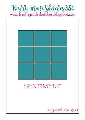
When I created this card, it was for the What Will You Stamp Challenge, WWYS#211 for the Vibrant Vases, and Freshly Made Sketches FMS380 provided the layout. I missed the deadline for WWYS#211, but I am going to make the FMS380 deadline. The color pallette was provided by Color Throwdown, ctd535.
Here are all the challenge banners:


Here’s my Vibrant Vases, Freshly Made Sketches, and What Will You Stamp card:

Flower Fun
I first stamped all the flowers in Basic Black, and then used the two-step stamps for the roses and the daisies in Daffodil Delight. Coloring over the stamped Daffodil Delight ink with my Stamping Up Stamp Write markers allowed me to lightly shade the flowers.
I thoroughly enjoyed coloring these flowers with the Daffodil Delight, Old Olive, and Real Red Stamping Write Markers. I didn’t dare try to use the Stamping Blends because the flowers were small and I didn’t want it to run. Coloring relaxes me, and when the SU stamps provide beautiful images, how could I not love the coloring.
The sentiment is also from Vibrant Vases. I used the Stitched Shapes small rectangle to crop the flowers, and the Rectangle Stitched dies for the sentiment. All the squares and the sentiment got the popped-up treatment from some dimensionals. Finally, I placed some of my current fave ribbon, the tulle polka dots, under my greeting and I was done.
Mar 22, 2018 | Global Design Project |
Global Design Project #130
This week’s sketch is full of fun layers. I used the reverse side of the Sweet Soiree foil and floral papers, mainly because I like the polka dots. The Marina Mist swirl paper is fun as well, and they both work well together.
Here’s my card:

Here’s the GDP#130 sketch:

Even though my card doesn’t have the second tilted layer, and my ribbon is around my toucan element, I still have the sketch at heart. Marina Mist cardstock provided the base and mat for the polka dot DSP. The swirled DSP (doesn’t it remind you of learning how to write in cursive?) is mounted on Daffodil Delight. I used the Stamp Write markers to color the toucan in Old Olive, Marina Mist, and Daffodil Delight then fussy cut him out.
The toucan and the matching sentiment are from the Bird Banter stamp set in the Occasions catalog. This 19 piece photopolymer stamp set is full of adorable birds, sentiments, and accessory stamps.
I stamped another toucan on the Daffodil Delight circle cropped with the Stitched Shapes thinlits so I wouldn’t have to fussy cut the toucan’s legs and feet. Mini-dimensionals provided the pop and dimension I wanted for the toucan. This time I colored the sides of the dimensionals with the Old Olive marker before I adhered it to the circle. The ugly side of this toucan follows:

I have to say, the sides of the dimensionals really soak up the ink. I mean really soak it up, so I had to color the sides multiple times.
Baker’s Twine around the circle
I used to have a terrible time putting twine under elements like this circle. Then I found that using double sided tape allows me the flexibility to play around with the placement of the twine or thread. I should have taken a picture, but I forgot to do that before I adhered the circle. Next time I will.
Love these colors and papers!
I love this combination so much that all the pieces of DSP and cardstock are just waiting for inspiration to hit. I am going to use the papers for another sketch challenge this week. Stay tuned!
I’d love to hear what you think about this card, stamp set, or DSP combination.
Have a Peachy day!
Feb 18, 2018 | Global Design Project |
Fab Friday # 130
Fab Friday Fab Five picks came out on Friday and I couldn’t have been more honored! My panda birthday card was one of the Fab Fives, and I couldn’t have been more tickled! You can see that card, and all the other entries and Fab Five picks here. It’s the second time I’ve been a Fab Five pick, and I am very thankful for the honor.
Global Design Project #125
This week’s challenge is a color challenge using Melon Mambo, Dapper Denim, and Daffodil Delight. I love all of these colors individually, and they really pop when put together. This fun color combination just screamed flower to me, hence the use of the Daisy punch and stamp.
Here’s my card:

Now that I look more closely, I think the circle cropped using the Stitched Shapes circle die and the mat for the DSP are Crushed Curry. However, since the flower is definitely Daffodil Delight, it still counts, right? The Melon Mambo mats for the Pretty Label Punch and the card base and the ink on the sentiment take care of color # 2. I used one of my very favorite DSP stacks for the 2016 – 2018 In Colors. These two-sided papers are bright and cheery florals, stripes, words, and dots. Love!
The daisy is from the Delightful Daisy stamp set and was cropped using the coordinating punch. Such a fun combination! I wanted to make sure it popped off the Dapper Denim DSP, so I cropped out a circle in what turns out to be Crushed Curry.
Last color was Melon Mambo as the label and sentiment colors. The Beautiful You stamp set provided the sentiment. I thought that it was generic enough to make this a birthday celebration card as well as a card to celebrate an accomplishment, job change, etc.
GDP#125
Here’s the color challenge for GDP#125:

Have a Peachy Day!
Jul 27, 2017 | Uncategorized |
The generic colors for this week are a raspberry pink, green, and yellow. I chose Berry Burst, Old Olive, and Daffodil Delight, and went to one of my current fav stamp/punch bundle using the Daisy Delight set.
I had made my own background paper and colored daisy using this bundle for another challenge in different colors. For this challenge, I wanted to keep it cleaner, even though the background is stamped, so I didn’t add an extra punched daisy.
Here’s my card:

I actually created a 5.5 x 8.5 sheet of this paper so I can make another card later. I used the daisy stamp and alternated stamping off daisies for both layers to give the card a bit of dimension. I used the leaf two-step stamps fromthe same set by stamping off the background and then using the detailed stamp full strength, again for dimension. The center of each daisy is Daffodil Delight, as is the ribbon. The greeting is from Beautiful Branches, stamped and punched with the Pretty Label punch, which was then mounted on Stitched Shape circle and attached to the card with dimensionals. When I kept staring at the card thinking that something was off, I realized I needed color on the right hand side by the label instead of all that white space. I grabbed my Old Olive enamel shapes, which balanced the card to my satisfaction.
I am still struggling with bows right now, but at least I managed to get a little one for this card. I like this card a lot because, while it has a lot on it, there is still a calming feel to it.
Here’s the challenge sketch:
 Colors just scream summertime, don’t they?
Have a Peachy day!


 Colors just scream summertime, don’t they?


