Jun 29, 2019 | Color Throwdown, Freshly Made Sketches |
FMS394 and ctd549 for a Colorful Combination
These two challenges are two of my “favorites”, at least this week. The clean, fresh FMS sketch seemed to pair perfectly with ctd this week to create a cute little thank you card.
The challenge banners follow:
I chose to use the newly retired Bella and Friends stamp set, which I just realized was actually retired when the new catalog launched. Sadness.
Here’s my card:

Keeping it Clean and Simple
I needed all the white space on this card, but didn’t want it to just be plain white. Therefore, I used the Subtle TIEF, which quickly becamse my favorite and most used embossing folder. I get the best of both worlds: white space and a little, subtle texture.
My choice for the orange on this card is inspired by the Painted Seasons DSP using Grapefruit Grove. I’ve only recently opened the package of DSP and love the colors and most of the patterns, especially this simple repeating pattern.
Following the FMS layout and the ctd colors, I layered the DSP on a piece of Basic Gray. I also used Basic Gray for all the stamping, and for coloring in the bone, which seemed to fade right into Bella so I outlined it in Basic Black. While I thought this plan would work, I quickly found out the outline jumped off the card, and not in a good way. Therefore, I colored over the black and the gray with Smoky Slate, which really toned the bone down.
Putting the Card Together
The layering circle die set provided the perfect sizes of circle for Bella, and the scalloped mat peeking out from under her. Blueberry Bushel cardstock provided all the mats: card base, Bella’s circle, and the sentiment mat. I cropped both of the sentiment pieces using the Rectangular Stitched layering die set (a must have!). I also colored Bella’s collar using Blueberry Bushel. Originally, the heart from the stamp was colored using Grapefruit Grove, but I later decided to cover the heart with a single piece of bling from the metallic exposy shapes.
That’s it. Finished. A fresh, clean, card using a great color combination. All is well. Life is good.
Thanks for stopping by today! I know your days are busy, and I appreciate your time.
Have a Peachy day!
Sue
Jun 10, 2019 | Color Throwdown, Freshly Made Sketches |
 Combining a Color Challenge with a Sketch Challenge
Apr 22, 2019 | CAS(E) This Sketch, Color Throwdown |
Bunny cards, lots of bunny cards
I’d made 20 Easter cards for my great nieces, ages 18 months and 2.5 years, to take to school and day care on Thursday. So, so cute, and they would have been good for the CTS and Color Throwdown challenges.
Here are just some of those cards since I’d already delivered some of them:


and the inside:

The Gingham Gala DSP came in very, very handy for this card, as did the Best Bunny stamp and punch. I did find out that it is much, much easier to stamp, then color all those bunny pieces before punching them out! Just believe me here.
All Those Parts and Pieces
Any time I am doing a mass production of cards I do all the parts needed first. For this card, that meant running cardstock through the Subtle TIEF in the Big Shot and then cutting down into strips. Then I used the two largest ovals from the Stitched Shapes die set out of various colors of cardstock. The mats for all these cards have ovals cropped out of them, but no one else knows once the gingham DSP covers them up. The DSP was all cut down to 4 x 5.25 inches. Next were 40 Pretty Label Punch pieces, since each card required two pieces. I used the retired “Happy Easter” stamp for the front and the Best Bunny stamps for the inside.
In between all these pieces, I was stamping, coloring, and punching bunnies. At one point, I just had piles of bunny pieces all over my grid paper on my desk.
About halfway through these cards, I realized I hadn’t counted all the steps needed for each card. However, by then I was too far into it and didn’t want to really know how much was left.
The Two-fer Card
While I was working on all these, I just happened to check the challenges for the week. I found out that, unknowingly I had nailed the CTS sketch for the week. When I checked the Color Throwdown challenge, I knew that I could cover both challenges with one card. Color Throwdown was orange, blue, and yellow. BAM!
Here’s that card:

Next, I Needed Another 20 Easter Cards for Me
But those cards will be shared on Wednesday, with another version, for the InKing Royalty Blog Hop. It’s another fun fold card, but it’s one of the easiest I’ve even done. Stay tuned!
Thanks for stopping by today.
Have a Peachy day!
Sue
Mar 24, 2019 | Color Throwdown, Freshly Made Sketches, What Will You Stamp? |
This Should Have Been a Three-fer.
When I created this card, it was for the What Will You Stamp Challenge, WWYS#211 for the Vibrant Vases, and Freshly Made Sketches FMS380 provided the layout. I missed the deadline for WWYS#211, but I am going to make the FMS380 deadline. The color pallette was provided by Color Throwdown, ctd535.
Here are all the challenge banners:

Here’s my Vibrant Vases, Freshly Made Sketches, and What Will You Stamp card:

Flower Fun
I first stamped all the flowers in Basic Black, and then used the two-step stamps for the roses and the daisies in Daffodil Delight. Coloring over the stamped Daffodil Delight ink with my Stamping Up Stamp Write markers allowed me to lightly shade the flowers.
I thoroughly enjoyed coloring these flowers with the Daffodil Delight, Old Olive, and Real Red Stamping Write Markers. I didn’t dare try to use the Stamping Blends because the flowers were small and I didn’t want it to run. Coloring relaxes me, and when the SU stamps provide beautiful images, how could I not love the coloring.
The sentiment is also from Vibrant Vases. I used the Stitched Shapes small rectangle to crop the flowers, and the Rectangle Stitched dies for the sentiment. All the squares and the sentiment got the popped-up treatment from some dimensionals. Finally, I placed some of my current fave ribbon, the tulle polka dots, under my greeting and I was done.
Jul 9, 2018 | Color Throwdown |
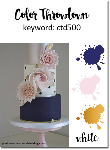
500 Challenges! WOW!
Color Throwdown is celebrating their 500 (!!) challenge this week. 500. weekly. challenges. A huge accomplishment therefore, many, many congrats are in order.
The color combo for this week got it’s inspiration from a fireworks display: navy blue, blush, gold, and white. I used Night of Navy, Blushing Bride, and gold accents in the form of ribbon, thread, and Wink of Stella. I’m not really a gold person and making this card convinced me that I need to at least have more gold embellishments.
Here’s my sweet card:

Here’s the ctd500 challenge link:
Varied Vases is such a sweet stamp set, and the coordinating punch makes it very easy to use individual pieces. Million dollar sales demo, Mary Fish ( in whose third level I happily belong), designed the set, including her signature tulip. I used Night of Navy and white Tutti Frutti DSP, also retired, to punch out the vases. Night of Navy, Blushing Bride, and Whisper White paper, inks or Stamping Write markers were the only colors used, which I think adds to the sweetness.
My Need for Gold is Evident
I really thought I at least had gold faceted gems. Wrong. Therefore, I have had to resort to just touches of gold. The ribbon used across the separation between the Night of Navy and Blushing Bride cardstock for the base of the card. The gold thread, also retired, forms a sweet little square knot on the two smaller vases. Wink of Stella, also retired, highlights the stems and flower centers.
Clear Wink of Stella usually is difficult to see in pictures, but the gold one photographs much easier. Here’s a close-up of the Wink of Stella and gold thread touches:

Thank you for stopping by my blog today.
Have a Peachy Day!
Sue
Jun 12, 2018 | CAS(E) This Sketch, Color Throwdown |
Have to Love a Two-fer!
Color Throwdown #496 is one of my favorite color combinations with black, aqua, and white. CAS(E) This Sketch #275 is a Retro sketch from CTS#3. I put both of these challenges together, and used on of my current fav stamp sets, Petal Pallette, and also the Sheet Music background stamp. Petal Pallette, Swirly Bird, and Stitched Shapes die sets were also used. WOW! When I type everything I used, it appears that the card would be a hot mess, but I think it is actually pretty clean.
Here’s my card:

All These Parts Working Together
I had the basic card in my head, and knew I would turn to Petal Pallette yet again. I just love that bird, the sentiments, the label die, all of it. The rest evolved.
Pool Party is a soft color, and I wanted that to contrast with the black. The CTS sketch called for a vertical banner on the left, but I wanted something with more movement. Therefore, I turned to Swirly Birds die set. I thought I needed more white space so I ran the die through the Big Shot again and used the white negative space on the left border. I cropped out the Basic Black and Whisper White circles using the Stitched Shapes dies, and also cropped the bird.
When I started to layer everything together, I realized the Pool Party base needed something and that’s when I decided to pull out my Sheet Music background stamp. I used Pool Party and stamped it off once for a very subtle background. The bird really needed to stand out, so I Bermuda Bay Stamping Write marker so it would still be aqua, but a deeper shade. Then I decided that the white circle was just too white and blank. I pulled out the leaves stamp from Petal Pallatte, used Pool Party stamped off once for another subtle element. The pieces just need to be put together using dimensionals, Tombow liquid glue, a ribbon, and two Bermuda Bay enamel shapes.
Challenge Sketches
Here’s the CTS challenge:

I hope you can see the inspiration of the sketch in my card. My circle wasn’t cropped out of the banner, but the inspiration was there.
Here’s the CTD challenge post:

Thank you for visiting my blog. I enjoy reading comments, so please feel free to leave one.
Have a Peachy day!
Sue