Jul 24, 2019 | InKing Royalty Blog Hop, The Library Challenge |

Welcome to InKing Royalty’s July Blog Hop!
This year’s Blog Hop themes are inspired by a single word – and this month, our projects are centered around SUNSHINE. The Sun is the single most important source of energy for life on Earth – it guides our clocks, calendars and planting schedules. We may be enduring a heat wave this week, but we still associate the Sun with positivity, joy and renewal. We are excited to share our creations with you today! After you read my post, I hope you’ll hop over to the next person on the list found at the base of this post.
The Library Challenge and Sunshine!
One of the blog challenges in which I have enjoyed participating in the past is The Library Challenge, and I think the theme of challenge #38 fits with the InKing Royalty Blog Hop theme of Sunshine. Challenge #38’s book title is Five Weeks in a Balloon, by Jules Verne, and the project inspiration can come from the title, cover, or story.
Here’s the cover:

How does this book relate to sunshine for the Blog hop? I am so glad you asked. I can’t imagine taking a hot-air balloon ride on a stormy, rainy day. The perfect weather for this kind of adventure is SUNSHINE, so there’s the connection.
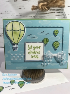
Here’s my card:


A Go-To Die Set
I’ve said it before, but the Rectangle Stitched Framelit die set is one of my all-time favorite sets, partly because I love the double stitching on each die. However, my most favorite reason is because of the amount of cardstock I can save by using these framelits on the mats of cards!
For example, in this card, the background Balmy Blue cardstock is the middle of a mat for another card. I chose the appropriate sized die for the frame based on the size of the middle mat, and then used the rectangle dies. I now have the two pieces I needed for the frame card and another center piece for a different card.
Here’s an example cut I cropped from the Granny Apple Green cardstock base:

I found that I absolutely love (!!!) the color combination of Balmy Blue, Blueberry Bushel, and Granny Apple Green when I played along with the Paper Players #450 challenge. I decided to go with Granny Apple Green balloons, the largest of which I stamped off. The smaller balloons also in Granny Apple Green, colored the baskets with Blueberry Bushel, then fussy cut the balloons. I stamped the sentiment in Granny Apple Green as well, and cropped it using the Stitched Shapes dies. I used Blueberry Bushel marker to color in the stitched ditch
The Balmy Blue Background Cardstock
When I was finished with the balloons, I used the cloud stamp (3 clouds, one stamp, wonderfully easy) and StazOn Cotton White ink for the clouds. The resulting light white and lighter white clouds gave the Balmy Blue some much needed texture.
After I got the frame and base put together using dimensionals, and then dry fit the balloons and sentiment piece, I thought I needed something else. The Whisper White Polka Dot Tulle added some interest without bulk, so I threaded it through the frame. I really thought I would wind up with a square knot, again, as always because I am “bow challenged”. But, to my surprise and glee, I created an actual bow! YEAH!
I popped all the pieces up with dimensionals and again realized I needed something else, more specifically something flat and not popped up. Therefore, I grabbed the bird stamp, stamped it a couple of times and it finally felt done.
Thank you for stopping by today. I hope you’ll hop along to the next stop on the blog hop, Lynn Holcun at Avery’s Owl. You don’t want to miss all the inspiration found in this group!
- Brian King at Stamp with Brian
- Sue Jackson at Just Peachy Stamping
- Lynn Kolcun at Avery’s Owlery
- Julie DiMatteo at The Paper Pixie
- Shawn de Oliveira at Shawn Stamps
- Jennifer Spiller at Westside Paper Creations
- Jackie Beers at Blue Line Stamping
- Jan Dufour at Stamp Me Silly
- Katie Ferguson at Cottage Paper
- Pam Morris at Tap Tap Stamp
- Sheryl Sharp at Sharp Notes by Sheryl
- Robbye Hamilton at Miss Hammie’s Crafts
- Candy Ford at Stamp Candy
- Linda Krueger at The Stamp Coach
Jul 7, 2019 | Just Add Ink |
Something New, Times Two
At one point or another, I am fairly certain that everyone buys a stamp set with all intentions of using it. However, new sets come along and the “WOW I MUST use this set” feeling starts anew. That’s exactly what happened with Wishing You Well. So, the stamp set is new, and I am fairly certain I haven’t participated in the Just Add Ink challenge before. So, two new things for this card.
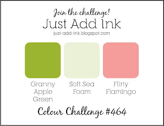
Here’s the challenge banner:

The card I created is a window card and these type of cards are not necessarily difficult to create.
Here’s my card:


I used Granny Apple Green dark and light blends to color the foliage and Soft Sea Foam marker for the recessed, for the lack of a better word, stems and leaves. The Flirty Flamingo marker created a beautiful bow and buds on this card.
I can hear you asking yourself where in the SU catalog can you find Granny Apple Green pearls. It’s simple and you can do it as well! The Stamping Blends will transform the standard pearls to any color you want. Just color, let dry thoroughly, then add to your project. Ta-Da!
Creating the Window
The Rectangle Stitched Dies have become my go-to dies. I’ve always, as much as possible punched out shapes from my mats. These dies allow me to do that on a larger scale. Rarely, if ever, will I create a card with a full base.
This fabulous die set always makes creating a window card easier. First, I needed to decide where to place the focal stamp, and then I placed the larger die. The only tricky part was the inside Granny Apple Green layer. I used my Sea Foam Green layer to center the next smaller die and then cropped that as well.
I did make a mistake on one of the corners of the top layer, so I used a corner rounder on each corner.
After I was finished with everything, I realized I didn’t have room for a sentiment. Miscalculation – check. Once again used the Rectangle Stitched dies and figured out what size I would need for the sentiment. It was also important that the cropped rectangle would be centered and rest on the Granny Apple Green layer. Problem solved.
Card is Done
Now that I have used this (retired) stamp set, I can see myself using it again and again. Isn’t that bow simple beautiful?
Thank you very much for stopping by my blog today. I greatly appreciate your time.
If you haven’t already subscribed, please enter your email and you will recieve an update for each blog post.
Have a Peachy Day!
Sue
Mar 20, 2019 | InKing Royalty Blog Hop, Uncategorized |

Welcome to InKing Royalty’s March Blog Hop! This year’s Blog Hop themes are inspired by a single word – and this month our projects are centered around GREEN. We are excited to share our creations with you today – there’s a wonderful variety of styles and occasions celebrated in this hop! After you read my post, I hope you’ll hop over to the next person on the list at the base of this post.
March = Irish = Green
It’s March, I’m Irish, so of course, the theme of green is perfect. My first thought was that it was time to break out the frogs from So Hoppy Together cling stamp set. After waiting for the corrdinating dies to arrive, they became unorderable. Therefore, I really needed to demonstrate one way they can be used without fussy cutting. This fun fold card really developed as I worked, and I enjoyed the process. After watching Jan B’s W fold tutorial video and tweaked the size so my final project is 4.25 ” by 5.5″. The learning curve on this turned out to be steep, but wouldn’t have been if I followed more of the directions on the tutorial.
Oh, So Many Greens
Here’s the front and back of my card:


I used the Light and Dark Granny Apple Green Stamping Blends to color all the frogs on this card. The dragonflies and cute little bugs were colored using Stamping Write Markers in Granny Apple Green and Shaded Spruce. All of these markers coordinate with the Tropical Escape DSP, from which all the patterns came that I used in this card. This DSP coordinate fabulously with the Frogs! I tried to use really fun patterns, especially since the frogs are nothing by fun!
The base of the card is Granny Apple Green, with a thin Basic Black mat under the DSP on both the front and back. I really felt that something else needed to be added to the front of the card, so I used 3 of the smallest black faceted dots. I used the Sale-a-Bration Granny Apple Green ribbon and the Dotted Tulle ribbon (LOVE!) layered and knotted on the front. The sentiment on the back of the card is from the Vibrant Vases stamp set from the Ocassions catalog.
The inside of this card was a product of love and patience. I could see what I the final card that wanted in my head, but it wasn’t easy. You know when you get ink where you didn’t want it and have adhesive seep out of the layers all adds up to walking away for a bit and coming back. That’s exactly what I did.
Here’s three different views of the inside:


Inside, I took a chance on the busy DSP, but since the frog panels are clean, I think it works.
Things I Learned:
I should have paid more attention to Jan B. when she explained about needing the ribbons to tie the card shut. Since I didn’t follow her directions, I had to put the ribbon between the Basic Black 1.5″ x 11″ strip and the DSP. Then I had to quickly move the ribbons’ positions to line up with the ribbon on the front. The sentiment on the front and the inside are both from So Hoppy stamp set, while the back sentiment is from Vibrant Vases in the Ocassions catalog, yet another wonderful stamp set!
It was very helpful to do all the cropping in the Big Shot as soon as I stamped the frogs, even before I colored them. I used the new Rectangle Stitched Framelits (in the Ocassions catalog) and my very well loved Stitched Shapes framelits.
When taking pictures of my card, I figured out that I need to practice using my iPad. The first set didn’t come out well at all, so I went back to what I know, using my iPhone.
Through the whole process, which took more than one night, I happily colored, relaxed, created, and enjoyed my time. Isn’t that part of the reason we do what we do?
Enjoy the Remainder of the Hop!
Thank you for stopping by today. I hope you’ll hop along to the next stop on the blog hop, Candy Ford at Stamp Candy. You don’t want to miss all the inspiration found in this group!
Have a Peachy day!
Sue
- Brian King at Stamp with Brian
- Shawn de Oliveira at Shawn Stamps
- Jackie Beers at Blue Line Stamping
- Sue Jackson at Just Peachy Stamping
- Candy Ford at Stamp Candy
- Jennifer Spiller at Westside Paper Creations
- Pam Morris at Tap Tap Stamp
- Julie DiMatteo at The Paper Pixie
- Robin Myren at Songbird Designs by Robin
- Robbye Hamilton at Miss Hammie’s Crafts
- Denise Hoepfner at The Mountain Magpie
- Lynn Kolcun at Avery’s Owlery
Feb 24, 2019 | Global Design Project |
Melon Mambo, Coastal Cabana, and Granny Apple Green
Who knew? Without this challenge, I would never have put these three colors together. However, they really work together. The combination of these colors are fresh and bright.
Short and Sweet
Here’s the #GPD177 challenge icon:

Here’s my card:


I tend not to look at the design team members’ cards when I open the page. In this case, I probably should have done so because their cards are awesomely sophisticated. Mine, on the other hand, is quite whimsical.
The mats for this card are Melon Mambo topped by Granny Apple Green. I used the bokeh dot stamps from the Beauty Abounds cling stamp set in the Ocassions catalog. Love bokeh! Using Whisper White as a base, I started with the Melon Mambo and the larger of the two stamps to cover the white. Next, I used Coastal Cabana on the small bokeh stamp and interspersed it between the larger dots. The Granny Apple Green dots are actually the white pearl basic jewels which I colored with the Dark Granny Apple Green blend marker.
Finishing the Front
After creating my own DSP, I cut it into thirds, and used my Coastal Cabana marker to color the edges of each of the three pieces. Popped all of them up on mini-dimensionals, and put them on the Granny Apple Green mat. Then I decided to add the ribbon, and thankfully I was able to slip it between the dimensionals and tie if off in a square knot. I used two sentiments from the Incredible You stamp set, also in the Ocassions catalog, and cropped them using the Stitched Shapes framelits and the Layering Oval framelits.
I then stamped the inside bokeh dots, and the envelope to match. And, ta-da, I was done.


