Jun 4, 2018 | Freshly Made Sketches |
True Gentleman
My DH was with me when I picked up my freshly spiral bound catalog, complete with plastic front and back covers. Since I was driving, he started looking through the catalog and commented while looking for sets to create masculine cards. He challenged me to make a completely masculine card. The retired True Gentleman DSP fit the bill. I love this paper!
Freshly Made Sketches 339
Sometime this past week, which was exam week and the last week of school, I vaguely remembered seeing this sketch. However, I had to go back and find the challenge, which was the inspiration for this card.
Here’s my card:

OCD moment: Is it just me, or does everyone have to have even numbers for the dimensions of the enlarged photo?
Here’s the challenge sketch:

What I love about the Freshly Made Sketches challenge is the clean and simple sketch posted each week. I enjoy creating cards with lots of white space, and, once again, this challenge delivers loads of inspiration.
It’s all about the DSP and the colors!
I loved this DSP as soon as it came out in the Holiday catalog this past year. The combination of the Tranquil Tide, Dapper Denim, Night of Navy, and Very Vanilla is classic. For this card, I used the bold plaid print combined with the subtle stripes with accents of Very Vanilla. The angled cuts have a thin border of Night of Navy. The card itself is Very Vanilla, and the base is Tranquil Tide.
I used the Truly Tailored companion stamp set for the simple greeting. Originally, this is where I stopped, took the post picture and realized the card needed a bit of something. When I pulled out my Night of Navy enamel shapes and found I only had hearts (not for a masculine card), two stars and one circle, Never fear, the Rule of Threes could still be implemented using the stars and circle. After I added the enamel shapes, I squinted at my card to check for balance, and decided I was done.
Feb 18, 2018 | Global Design Project |
Fab Friday # 130
Fab Friday Fab Five picks came out on Friday and I couldn’t have been more honored! My panda birthday card was one of the Fab Fives, and I couldn’t have been more tickled! You can see that card, and all the other entries and Fab Five picks here. It’s the second time I’ve been a Fab Five pick, and I am very thankful for the honor.
Global Design Project #125
This week’s challenge is a color challenge using Melon Mambo, Dapper Denim, and Daffodil Delight. I love all of these colors individually, and they really pop when put together. This fun color combination just screamed flower to me, hence the use of the Daisy punch and stamp.
Here’s my card:

Now that I look more closely, I think the circle cropped using the Stitched Shapes circle die and the mat for the DSP are Crushed Curry. However, since the flower is definitely Daffodil Delight, it still counts, right? The Melon Mambo mats for the Pretty Label Punch and the card base and the ink on the sentiment take care of color # 2. I used one of my very favorite DSP stacks for the 2016 – 2018 In Colors. These two-sided papers are bright and cheery florals, stripes, words, and dots. Love!
The daisy is from the Delightful Daisy stamp set and was cropped using the coordinating punch. Such a fun combination! I wanted to make sure it popped off the Dapper Denim DSP, so I cropped out a circle in what turns out to be Crushed Curry.
Last color was Melon Mambo as the label and sentiment colors. The Beautiful You stamp set provided the sentiment. I thought that it was generic enough to make this a birthday celebration card as well as a card to celebrate an accomplishment, job change, etc.
GDP#125
Here’s the color challenge for GDP#125:

Have a Peachy Day!
Feb 8, 2018 | Uncategorized |
Beautiful Peacock
I saw the sketch for CTS#258 this morning and decided to try out the SAB stamp set (free with a $50 purchase) Beautiful Peacock. I’ve seen some absolutely gorgeous cards on Pinterest using this set, and it was very helpful when trying to figure out how to use the set. I wound up using a mixture of full ink stamps with elements stamped off. Trust me, you want to play around with this set before you start on cardstock, and my current sheet of grid paper is a testament to playing around.
This stamp set is just gorgeous.

Color Choices
I knew I wanted something bold, and started with the DSP from Eastern Palace making Tranquil Tide and Dapper Denim the coordinating colors. Base and front of the card are Very Vanilla, which allowed the colorful peacock to shine. It’s a little difficult to tell in the picture, but there is a layer of Dapper Denim between the Very Vanilla top and Eastern Palace base. At first I was concerned these colors would be to intense. However, I’m pleased with the color choices for the body and feathers for this gorgeous bird, including the triple stamped off trailing feathers.
Extra Touches
I wound up fussy cutting the body of the bird and popped it up on mini-dimensionals for interest. The sentiment is from the Beautiful Peacock set and trimmed down to be a thin piece. When matted on Dapper Denim, then punched, the denim peeks out from the top and bottom. I didn’t want to create a dove-tailed banner for the sentiment and wound up using the Pretty Label punch. There are many videos on YouTube showing how to use punches for just the ends. Frankly, I was amazed that both ends lined up pretty much perfectly.
CAS(E) This Sketch #258 challenge

There are so many fun possibilities with this sketch. What will you do with it?
As always, I would love to hear your comments.
Have a Peachy Day!
Oct 24, 2017 | Uncategorized |
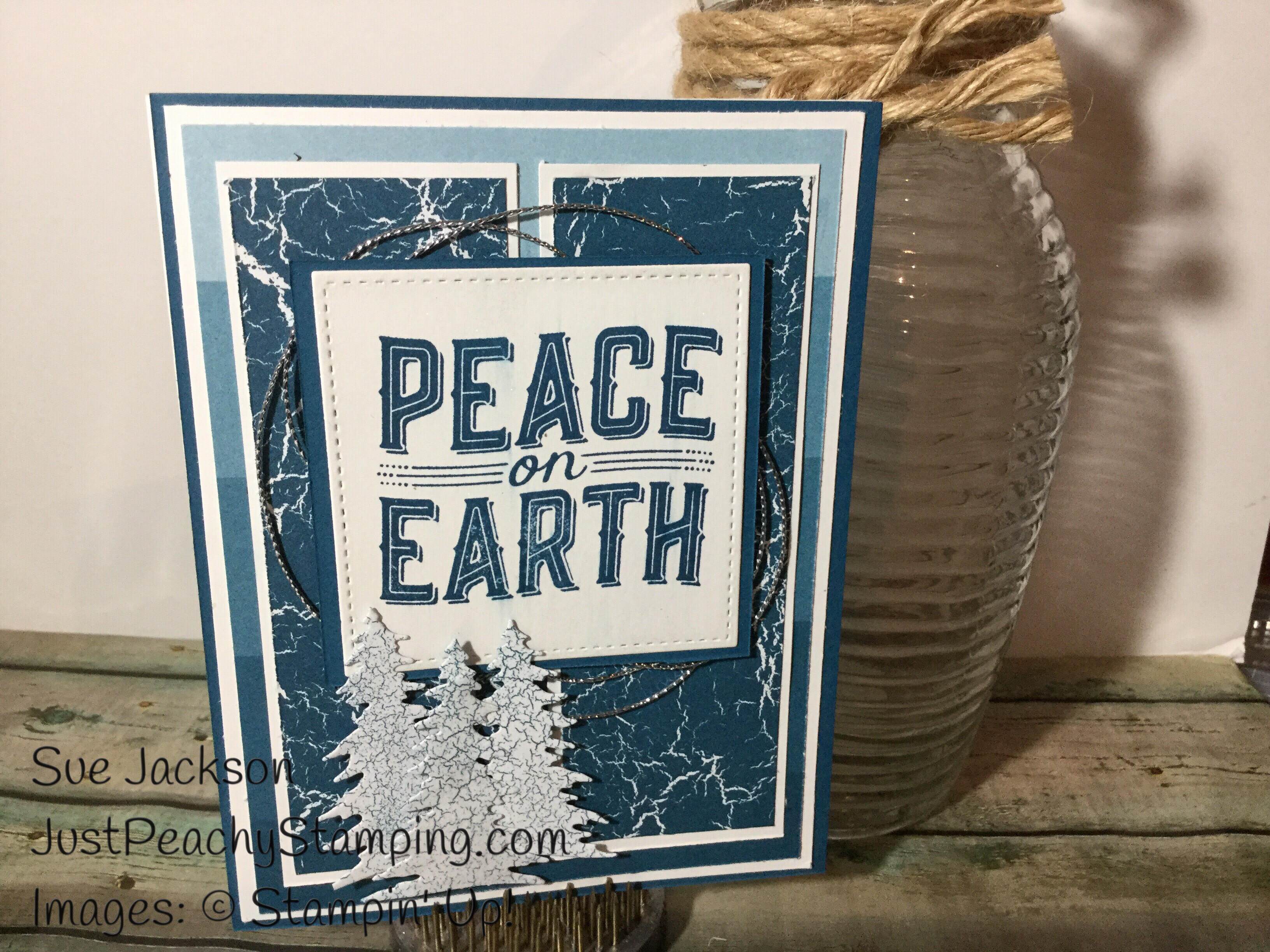
Have I said before I am a non-traditional Christmas colors kind of person? I love blues and silvers together for Christmas. When I saw the sketch for Global Design Project 110, I knew that I wanted to use the Color Theory DSP stack, specifically the Dapper Denim pieces. I hope that the card I created tonight is within the framework of the sketch!
I used Dapper Denim ink and Color Theory DSP, Whisper White, silver thread, and my Clear Wink of Stella (it’s very diffcult to see, but the whole sentiment has a couple of layers and the middle tree is covered as well). The stamp set and dies are from the Carols of Christmas bundle.
My card is definitely BLUE, and I hope the silver thread and Wink of Stella calm it down some what. This card is all about layers, layers, layers.
Here’s my card:

Here’s the #GDP110 sketch:

Have a Peachy day!
Sue


