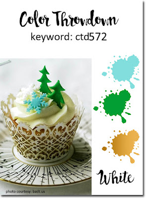
I just love all three of the elves in the #Elfie stamp set. Color Throwdown 572 consists of aqua, green, gold, and white. I’ve wanted to do a non-traidtional Christmas color elf card, and this challenge seemed perfect for just that.
Here’s the challenge banner:
Here’s my card:
Meeting the Color Throwdown Challenge
In order to meet the ctd challenge, I used Coastal Cabana, Bermuda Bay, Shaded Spruce, Whisper White, and Delicata Golden Glitz.
Shaded Spruce provided the color for the base and the present. After stamping the present on a scrap piece of Shaded Spruce DSP, I fussy cut it out. I also stamped a bow in Coastal Cabana, then fussy cut that as well. The result is a fun wrapping on the present for a pop of color.
I used Pool Party blends combo for the elf’s outfit and part of the ornament. Then I used the Shaded Spruce and Bermuda Bay blends combo for the rest of the ornament. I finished it off with a touch of gold provided by the gold Wink of Stella.
While coloring the elf, I found myself wishing I had gotten the puff paint from the holiday catalog so I could give the trim on the elf’s outfit some dimension. I wound up using the Fine Tip Glue Pen and then covered each piece of trim with some Dazzling Diamonds. Even though I’d already used the gold Wink of Stella on the bell on the top of the elf’s hat, I added Dazzling Diamonds there as well.
More Than Coloring
I knew I couldn’t just put the elf panel on plain Coastal Cabana cardstock. Therefore, I ran the cardstock through my Big Shot using the Brick and Mortar 3D embossing folder. Snowflakes seemed to be a must embellishment, so I grabbed the three from the Seasonal Layer Dies. I already had the Whisper White circle cropped, and the sentiment from #Elfie fit perfectly.
Using gold is part of the challenge, but I didn’t want to use some of the gold foil. I finally decided to outline the elf panel and sentiment circle using the Delicata Golden Glitz ink. Just those small touches of gold really pop off the card.
Short and sweet tonight. I must grade……. I must grade…….
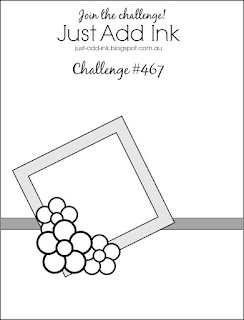
I love two-fers! Any time I can combine a color challenge (FabFriday168) and layout challenge (Just Add Ink #467), I am game.
Here are the banners for both challenges:
The Fab Friday colors are bright and happy and, to me at least, lend themselves to a whimsical card. Just Add Ink’s layout can be sophisticated, just as easily as it can be fun. I went with whimiscal and fun.
Here’s the inside and outside of my card:
Fab Friday Colors
In keeping with all my other blonde angels, I used the Pineapple Punch marker to color this angel’s hair. However, with just that one color, her hair looked very flat, so I pulled in Mango Melody to highlight her hair. I also used the Pineapple Punch DSP for the top 2/3 of the card.
Lovely Lipstick provided the color for the angel’s shoes and the enamel dots on her dress. I also used Lovely Lipstick DSP for the bottom third of the card.
I used Bermuda Bay in three somewhat subtle areas. First, I colored the dress using the blends combo. Second, I used the marker to color the stitching in the ditch created by the Stitched Shape dies. Finally, I pulled some retired ribbon to create a border between the two DSP pieces.
The final color, Pacific Point, provides the card base and the rotated mat for the angel.
Four colors accomplished. All the pieces were dry-fit and then attached using dimensionals and Tombow liquid glue.
Opinions
The four colors are pretty bright, but I really thought it worked all the way around. My DH and DD did not think so because they both thought the Pineapple Punch DSP on the top of the card was too bright. Did I mention that I had already adhered all the pieces?
In an effort to appease both of them, I decided that I would use a piece of vellum over the Pineapple Punch DSP to mellow it out. After some measuring, cropping, and very careful placement, I was able to get the vellum adhered behind the Pacific Point mat. At that point, I needed to figure out how to adhere at least the top corners of the vellum. I used the thin line glue to place a dot in each of the top corners and then covered the very small dots of glue with two more enamel dots from the Happiness Blooms dots.
I stamped the inside, decorated the front and flap of the envelope andshowed the new version of the card to my DH (dear husband) and DD (dear daughter). They both thought it looked “better”. I have to say, I agree that the more muted Pineapple Punch DSP helps to tone down all the bright colors.
Thank you very much for stopping by my blog today. I greatly appreciate your time.
Have a Peachy day!
Sue
If you live in the U.S. and are in need of a demonstrator, please CLICK HERE to be connected to my store. I would be honored to help you create cards from beginner levels, to casual, and to avid levels. Placing an order with me would also entitle you to a free copy of the Holiday Catalog being released the first week of September.
Just ONE more day to earn bonus coupons! $5 coupon for every $50 spent. I am really looking forward to spending my coupons on my holiday catalog pre-order!
About Me
Welcome to Just Peachy Stamping by Sue Jackson: an independent Stampin' Up demonstrator.
Through Stampin' Up!, I happily share my love of papercrafting through sales, classes, small stamping group meet-ups and workshops. I think that being a teacher in my "real life", I have a unique approach to sharing my fantastic hobby. I look forward to connecting with you!