Feb 4, 2018 | Uncategorized |
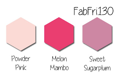
An Inspiration for Fab Friday #130
Many thanks to fellow InKing Royal, Lucy McFarland, (her card can be found at the bottom of this post) for her entry in our current #royalchallenge. She used the “grass” stamp from the Sheltering Tree stamp set to ground the panda, and I quickly wanted to copy it. Once the colors from the Fab Friday #130 challenge popped in my head, the card pretty much created itself, and the Emerald Envy grass really grounds the panda. The colors just scream happy, and what could be happier than a cute birthday card? Layering these sweet colors for the balloons and the mats was easy.

Party Pandas
This absolutely adorable stamp set is free with a $50 purchase during Sale-a-Bration until March 31. I love each of the 3 pandas and the simple sentiments in this set. Cuteness overload!! I used the sitting panda and masked off the top half of the the string and the balloon. The balloons were created using the Balloon Bouquet stamp set and punch, then layered with dimensionals. The balloon strings were then easy to add using the Basic Black Stamp Write marker.
Lucy McFarland’s adorable Valentine’s inspiration card:
 Isn’t this precious? Love it!
I’d love to hear your thoughts, please leave a comment below.
Above all else, have a Peachy day!
Feb 4, 2018 | Uncategorized |
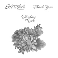
Heartfelt Blooms and Beautiful You stamp sets
This Sale-a-Bration stamp set (free with a $50 purchase) is gorgeous. However, if you add too much ink to the stamp, it will just come out as a big blob. Really.big.blob, which I think I have said before but is worth repeating. The sentiments with the set are perfect for a sympathy card, especially the “Sending Heartfelt Thoughts”, but I wanted something a bit lighter for this card. The sentiment is from the Beautiful You stamp set andI was pleased as punch when I found that it fit on the Everyday Label punch. The versatility of this flowered stamp makes it a must have. Can’t you just see some fabulous birthday cards, thank you cards, thinking of you cards……….

Tic-Tac-Toe Challenge 033 board

The first column of sentiment, free, and ribbon spoke to me as soon as I saw the challenge board. I originally needed a sympathy card for the parents of a student who died very unexpectedly. I couldn’t bring myself to write a blog about that card, which I created using the school colors of black and gold (Crushed Curry), but I wanted to honor Elena somehow. Enter the Emerald Envy and Basic Black card for this challenge.
Emerald Envy and Basic Black
I don’t know why, but I have been using a lot of Basic Black as an anchor color lately. Tonight, I used it to accent the Emerald Envy as a mat for the card base and for the punch. After I punched a label out of the black and emerald to use for the sentiment mat, each label was cut in half to just outline the ends. I’ve found that layering halves on a variety of punches is easier using two-sided tape, which was also used to hold the ends of the ribbon on the back of the Whisper White layer.
We might as well DANCE
For as long as my daughter can remember, I have told her “I hope you dance”, and it’s one of “our” songs. The sentiment from the Beautiful You stamp set is perfect for the times life is a bit of a struggle.
I’d love to hear your thoughts. Please leave a comment below.
Above all else, have a Peachy day.
Jan 30, 2018 | Uncategorized |
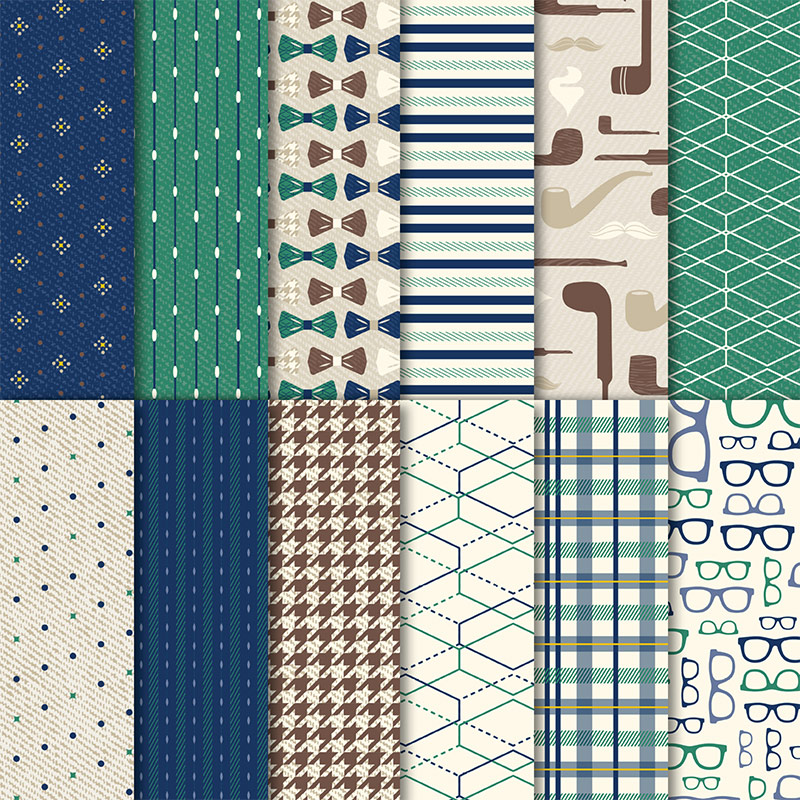
True Gentleman DSP
This DSP paper is gorgeous and fun! It is perfectly masculine, has fresh designs, fabulous colors (Chocolate Chip, Crumb Cake, Crushed Curry, Night of Navy, Tranquil Tide, and Very Vanilla), and coordinates so well with the Wood Textures DSP stack in the annual catalog. I made my DH’sdouble z-fold birthday card out of this paper and and he really liked it as well. (See that card HERE.) Love it!
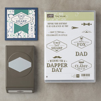
Truly Tailored Clear Mount bundle
This Occasions catalog bundle is the perfect companion for the DSP paper. This suite has a coordinating set of buttons, masculine corduroy ribbon, and a cardstock pack. The stamps themselves are fun and great for Father’s Day, birthday, or all occasion card.
Classy Kind of Guy
Sometimes, when I see a card in my head, it just comes together in a snap. However, I’d punched the pieces and played with them last week and couldn’t figure out what I wanted to do. Last night I went in my Blue Room (aka craft room or my room of random stuff) not knowing what I was going to create, pulled these pieces out and it all just fell into place.

This card came together pretty easily once I figured out the layout. I knew I wanted to include shapes punched from the Tailored Tag punch in 2 of the designs. These two patterns are actually the front and back of one of the DSP sheets. The Very Vanilla punched piece for the sentiment is matted with two Night of Navy punched pieces. When I got the card all glued down I thought I might need something else and added the Linen Thread surround. It adds some interest and dimension without overpowering the clean lines of the card.
I’d love to know what you think about this card and bundle, so please leave a comment below.
Have a Peachy day!
Jan 24, 2018 | Uncategorized |

Welcome to InKing Royalty’s January Blog Hop! This year’s Blog Hop themes will be inspired by popular songs – the first is “I Think I Love You.” Our Blog Hop today is jam-packed with projects that are perfect for Valentine’s Day or that showcase love. How sweet is that?! We are excited to share our love-themed creations with you today. After you read my post, I hope you’ll hop over to Candy Ford at http://stampcandy.net/.
Here’s my card:

I Think I Love …… eclipse cards.
This isn’t the first eclipse card I’ve made and it definitely won’t be the last. There are a few tricks that will help make this rather simple technique even easier. First, add a layer of thick cardstock to the back of the cropped letters to give them more stabilty. In this case, I added some thick Whisper White cardstock to each letter and the heart.
Second, it is much easier to use the foam adhesive strips than dimensionals. Trust me, I learned the hard way and you just have to take my word for it. Dimension is key to this technique, and two layers of the foam adhesive tape really lets the letters shine. This also helps to have more of the Fresh Fig base show through for each letter, which is another way to add dimension. Mini-dimensionals were cut down into quarters and I used two layers of those tiny pieces on the thicker parts of the heart (are there really any thick parts to this heart?).
I Think I Love……… the Painted with Love Specialty DSP.
I am usually not a gold person, or a foil paper person, but this paper is gorgeous! The colors work so well together and I used the Fresh Fig as the base and this DSP showcases all the fabulous colors from the stack. I thought the lighter colors would blend in too easily. The heart is just the reverse side of these adorable hearts on the front. I did have a difficult time deciding how to do the heart because I’d already had a huge eclipse fail using a detailed thinlet. While working with those little, tiny pieces of mini-dimensionals took some time, the result is just what I saw in my head when I started creating the card.
I Think I Love…….ribbon and thread.
The Gold Metallic Thread is so fine I knew it would get lost on the card without a background to ground it. Enter the Fresh Fig Finely Woven ribbon. The ribbon is flat on the card and I wound the Gold Thread around the cardstock a few times. Another tip: this thread will fray. I’ve found that it’s helpful to use the Fine Tip Glue Pen to add a couple of drops of glue to the thread before I cut it, which will keep it from fraying.
Thank you for stopping by today. I hope you’ll hop along to the next stop on the blog hop, Candy Ford at stampcandy.net
Have a Peachy day!
If you get stuck while hopping, please use this line-up as a guide:
- Mary Fish at Stampin’ Pretty
- Brian King at Stamp with Brian
- Jackie Beers at Blue Line Stamping
- Shawn de Oliveira at Shawn Stamps
- Louise Sharp at LouiseSharp.com
- Racheal Shedeed at Bluebonnet Stampin’
- Pam Morris at Tap Tap Stamp
- Lisa Pretto at Ink Big Academy Stamps
- Robbye Hamilton at Miss Hammie’s Crafts
- Jennifer Spiller at Westside Paper Creations
- Julie DiMatteo at The Paper Pixie
- Sue Jackson at Just Peachy Stamping
- Candy Ford at Stamp Candy
Jan 19, 2018 | Uncategorized |
I needed a special birthday card for my Dear Husband this week. I kind of had an idea of what I wanted to do, but found exactly what I wanted with a YouTube video for a double z-fold card by Dawn’s Stamping Thoughts. Her video was so easy to follow and I kept pausing the video so I could cut along with her measurements. The card looks complicated, but it wasn’t at all and it was fun to create.
Here’s the card:
:

The first picture is of the closed card, second one shows the inside. The DSP is from the True Gentleman suite, and it is fabulously masculine without smacking you over the head with it. I used the Happy Birthday thinlit and cropped it for 3 layers. The bottom is Night of Navy, middle is Tranquil Tide, and the top is Wood Textures DSP. The bases are all Very Vanilla. I tend to have a difficult time with liquid adhesives with this thinlit, and I don’t trust myself to use snail adhesive with all these layers. Enter my Xyron machine for the save. The inside sentiment is from the Picture Perfect Birthday photopolymer stamp set, another MUST HAVE suite. I used Chocolate Chip ink for the inside sentiment.
My DH was quite impressed and initially thought it took a long time to create. I was able to convince him it was not as complicated as it looks. I’ll definitely do this one again!
Have a Peachy day!
Jan 16, 2018 | Uncategorized |
Global Design Project 121 is a color challenge this week using Bermuda Bay, Peekaboo Peach and Sweet Sugarplum. I’ve seen some beautiful two-color cards with Heartfelt Blooms (Sale-a-Bration catalog), and really wanted to use the stamp set, so I thought this challenge would be wonderful for the set.
Here’s my card:

There is a trick to using this gorgeous stamp, though, and I’m so pleased I saw some comments from other SU demos who shared the trick: less ink is better. You do need to cover the stamp with color, but don’t overload it. Definitely play around on scrap paper a few times before trying it on your cardstock (you should see the current sheet of grid paper on my desk).
Bermuda Bay and Peekaboo Peach were easily covered with the bloom stamp, and I used peach for the sentiment, Bermuda Bay for the bottom base layer and the ribbon. I have Sweet Sugarplum just peeking out as a second layer and I cropped a Stitched Shapes circle to go behind the Pretty Label punch-out. I really wasn’t sure how the Sugarplum was going to work with the other 2 colors, but I am pleased with the contrast. Maybe I need to try the same card again with another main color combo…….something to think about.
Here’s the GDP challenge link:

Make sure you check out the cards from the design team, and especially from the guest designer, Julie DeGuia, for her adorable card!!
Have a Peachy day!
Stampin’ Up products for this card:
 Heartfelt Blooms
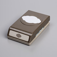 Pretty Label Punch
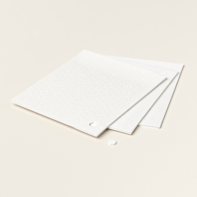 Mini dimensionals
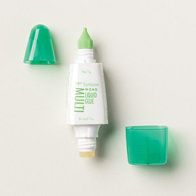 Tombow adhesive