Apr 4, 2018 | Uncategorized |
When at first you don’t succeed………
Fab Friday 134 posted a four color challenge consisting of Night of Navy, Soft Sky, So Saffron, and Powder Pink. You are thinking that sounds easy enough. It wasn’t, not for me, not this week. Suffice it to say that I have one card that came out more like CASE the designer, one that was posted for #tttc041, one that is still in pieces (and will be made into a card in the very near future), and this one today. I was in the blue room (craft room, aka room of random…..stuff) for a long while today trying to figure this out. Once I got it, it was just a matter of putting all the pieces together.
Here’s my card:

Here’s the challenge post:

Stamp sets, die sets, adhesive, oh my.
When I finally had the idea in my head I started searching for stamp sets to match what I was seeing. I started by stamping the So Saffron dots from the Timeless Textures stamp set. Then I went back with the larger floral stamp from Amazing You clear mount stamp set. I finished with the Powder Pink small flower from Petal Palette. I also used the tag die (top and bottom tags) and the die peeking out from under the top tag from the Petals and More thinlits. The amazing focal point is from the Celebrate You thinlits. Oh, and in my jar of bakers twine I found some Night of Navy twine from what must have been a Paper Pumpkin kit. Score!
Night of Navy for the win
Three of the colors were soft, whereas Night of Navy is regal. I knew the Navy needed to be the bold pop of color on this card, so I used it on the top, middle, and bottom for balance. The bottom “to me” tag was an afterthought, but I am pleased with the subtle impact it makes, while also grounding the twine.
My next challenge was giving dimension to the amazing die cut. Can you even begin to imagine how difficult it would have been to use mini-dimensionals for that? No way I could. I remembered some eclipse Christmas cards and some of the demos said they added layers to their letters for stability. So, I did the same thing for this amazing sentiment. There are four layers of the cropped word, which does give the dimension I wanted. Thankfully, I have a Xyron sticker maker, and it was relatively easy to get these layers to form one piece.
Here’s a close-up of the layers:

This close-up also highlights the Fine-tip Glue Pen dots for the centers of the pink flowers. It’s a bit difficult to tell, but I also went back and topped each and every yellow dot with Clear Wink of Stella. It is just so hard to get that to show up in pictures.
Apr 2, 2018 | Uncategorized |
Tic Tac Toe Challenge No. 041
The #tttc each week offers 9 possible card combinations. This week, I chose the top horizontal line of circle, flower, and die cut. I tried combining it with the color challenge from Fab Friday #134 which is Powder Pink, Night of Navy, So Saffron, and Soft Sky. What I got was a soft and sweet thank you card, even with the Night of Navy paper and ink. I also substituted Pool Party for the Soft Sky.
Here’s my card:

Here’s the #tttc041 challenge:

The soft and sweet elements
I used Night of Navy for the base of the card, the ink for the sentiment, and Stamping Write Marker for the outline of the Pretty Label Punch. I am getting better at using the marker to outline, as long as I remember to keep the marker below the punch. It’s possible to control the outline by angling the thick side of the marker on the outline.
The DSP is from the Whole Lot of Lovely DSP pack. Some of these sheets are soft and others are bold, but they are all lovely. Powder Pink flowers on the top, and the substitution of Pool Party on the bottom.
The die cut is from the Stitched Shapes die set. I love this set, use it often, and many times I use a Stamping Write marker to draw an outline in the ditch of the shapes. The So Saffron circle and mat under the DSP cover that color challenge.
When I got the elements together, I decided that it needed something, so I grabbed my Subtles enamel shapes. There are 4 Powder Pink enamel dots in the 4 whole flowers on the top. It just worked out that they surround the die cut circle. There are 3 Pool Party enamel shapes on the bottom in a triangle.
The sentiment is from the All Things Thanks stamp set. I had to use the Stamping Write marker to color just the parts of the sentiment that I wanted. However, I love this font and have colored it in many times to use just the “thank you” portion of the stamp.
Have a Peachy Day!
Feb 13, 2018 | Uncategorized |
Tic, Tac, Toe #34 Challenge
I chose the left vertical line of the tttc#34, Anything but a card, die cut, and green. I’m doing my very first vendor fair this weekend and wanted to have a little something for a door prize. After spending time on Pinterest, I decided on mini-desk calendars. Since that is the anything but a card, I needed a die cut and used the Stitched Shapes die set. The final element is green, so I used some Garden Green and Lemon Lime cardstock on a base of Painted Harvest DSP. The base of the calendar and the ink are Garden Green. The Beautiful You stamp set provided the sentiment.

Tic, Tac, Toe #034 Challenge Board

The Calendar Base
Figuring out the base involved a great deal of trial and error. I couldn’t find anything on Pinterest or YouTube that matched the size that I needed, which meant I had to figure out my own measurements. Don’t get me wrong, I love math, but this is where the trial and error occurred. The best thing I can share with you is to use a card-like base for the front and back. The mountain fold was a 4 inch x 4 inch cardstock square scored at 1, 2 , and 3 inches, The mountain fold is attached to the open ends of the calendar base. Once I figured out the measurements, I quickly cut all the pieces I needed to make a total of 6 calendars. The remaining 5 calendars are below:

I used the Every Day Label Punch for the sentiment and punched one lighter one for the sentiment. The mat is another punch cut in half, spread apart, and adhered to the back of the sentiment.
Feb 11, 2018 | Uncategorized |
CAS(E) the Designer for Global Design Project # 124
I just love the beauty of this flat stamp, free with a $50 purchase during Sale-a-Bration, and have used it a number of times. I’ve said it before, but it’s important to remember that you do not want to to over-ink this stamp for the best results. If you over-ink it, you will wind up with an ugly blob instead of a beautiful floral print. For this card, I used Basic Black and Pacific Point on Whisper White. I think this color combination is stunning, and it can also be elegant with the additional of silver metallic enamel shapes and silver thread for embellishments.

Copy and Selectively Edit for this CAS(E)
While I have been glancing at this sketch all week, this card idea literally popped in my head today. Nothing like last minute because the challenge link closes in 4 hours. Louise Sharp is this week’s designer, and her inspiration card follows:

The center element was created by cropping out the Bloom using the Layering Circle Dies, including the scalloped circle. Two layers of dimenstionals really allow this element to pop up off the cardstock. My first edit is with the thread, which I put behind the circle layers. My sentiment is on the bottom right corner instead of top right, mainly because it fit there. The silver metallic enamel shapes were a last minute addition because I felt the card just needed a little something.
Feb 11, 2018 | Uncategorized |
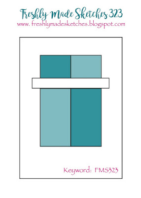
Freshly Made Sketches # 323
FMS sketches are always clean and simple. I pulled out the Picture Perfect DSP for the sketch, and then decided to use the sentiment from Magical Day. Pieces were cut, mats were trimmed, circles cropped, sentiment stamped, card assembled, then I felt something was missing. Enter Party Pandas, and the sitting Panda holding the balloon seemed perfect.
Here’s my card:

Magical Day
I just love, love, love this 6 x 6 DSP stack, so much so that I’ve already ordered another stack. The two sides of this paper coordinated beautifully, as always. The circles on the left and chevrons on the right are very graphic and seem to balance each other. I left open space on the black mat which gives the appearance of matting without actually doing it. The peach scalloped circle was cropped using the Layering Circle die set from the bottom mat to cut down on carstock waste. Whisper White sentiment base was cropped using Stitched Shape circle dies. A Bermuda Bay Stamping Write marker highlights the stitching in the ditch of the circle. Stamping Dimensionals gave some height to the sentiment.
Last Minute Party Panda
Once I got everything together, I started to think that there was nothing connecting the sentiment to the card. I have thoroughly enjoyed using the Party Pandas, so I thought… why not here as well. What could be more magical than a sitting panda flying off the large senitment circle layers? I stamped him, then fussy cut him out and popped him up using the mini-dimensionals, which allowed the string to tuck under the sentiment.
FMS323 sketch:
Feb 8, 2018 | Uncategorized |
Beautiful Peacock
I saw the sketch for CTS#258 this morning and decided to try out the SAB stamp set (free with a $50 purchase) Beautiful Peacock. I’ve seen some absolutely gorgeous cards on Pinterest using this set, and it was very helpful when trying to figure out how to use the set. I wound up using a mixture of full ink stamps with elements stamped off. Trust me, you want to play around with this set before you start on cardstock, and my current sheet of grid paper is a testament to playing around.
This stamp set is just gorgeous.

Color Choices
I knew I wanted something bold, and started with the DSP from Eastern Palace making Tranquil Tide and Dapper Denim the coordinating colors. Base and front of the card are Very Vanilla, which allowed the colorful peacock to shine. It’s a little difficult to tell in the picture, but there is a layer of Dapper Denim between the Very Vanilla top and Eastern Palace base. At first I was concerned these colors would be to intense. However, I’m pleased with the color choices for the body and feathers for this gorgeous bird, including the triple stamped off trailing feathers.
Extra Touches
I wound up fussy cutting the body of the bird and popped it up on mini-dimensionals for interest. The sentiment is from the Beautiful Peacock set and trimmed down to be a thin piece. When matted on Dapper Denim, then punched, the denim peeks out from the top and bottom. I didn’t want to create a dove-tailed banner for the sentiment and wound up using the Pretty Label punch. There are many videos on YouTube showing how to use punches for just the ends. Frankly, I was amazed that both ends lined up pretty much perfectly.
CAS(E) This Sketch #258 challenge

There are so many fun possibilities with this sketch. What will you do with it?
As always, I would love to hear your comments.
Have a Peachy Day!