Animal Outing for GDP # 143 & Take Two Clean and Simple Sketches
Animal Outing Fun
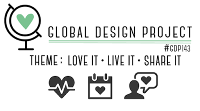
When I first saw this product suite, I was sold! I ordered the whole suite on my last order and finally had time to play with it today. The theme challenge for Global Design Project # 143 is Love it, Live It, Share It. Well, I love this suite and will be sharing cards from it often.
Earlier this week, I stumbled across the Take Two Clean and Simple Sketch Challenge. I thought the sketch layout would work with the Animal Outing suite, so I combined both challenges.
Here’s my card:

Here are the challenge sketches:
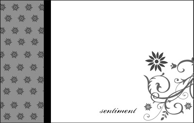
Have to Love a Challenge Sketch
When I am able to combine a theme challenge with a sketch challenge, I am a happy crafter.
I used the Smoky Slate light and dark Blendabilities to color in this adorable rhino. While I knew I wanted some sort of color on the tusk, I didn’t want it to be Smoky Slate. I first colored in the tusk with the dark Blendability, and then realized my mistake. Therefore, I pulled out the Color Lifter Blendability and just kept un-coloring (is that even a word?) throughout the whole card making process. The cute bird is colored with Berry Burst and Lemon Lime Twist Stamping Write markers, highlighting the colors in the DSP.
This Animal Expedition DSP pattern choice was made because I definitely wanted a bold contrast with the Whisper White base. I trimmed a piece of the DSP for the strip on the left side of the card. There is a border on the sketch, so I placed the DSP on a Smoky Slate background.
Accent Colors
I pulled the Lemon Lime Twist color out of the DSP, and used it for the Stitched Sketch die cut and the base of the card. The Whisper White background was necessary for the clean look, but I didn’t want a plain white background. Therefore, I embossed it with the Leaf TIEF, which really creates a deep embossed image.
I really think the Stitched Shapes need some dimension, so I used the Lemon Lime Twist marker to “stitch” in the ditch. This simple stitching adds this finishing touch, so I do it very, very often with these dies.
The sentiment was actually an after-thought because I realized after getting the rhino and the DSP strip on the white background that I had forgotten a sentiment. I had that exact piece of DSP left from my first cut, so I turned it over and stamped the sentiment on the lighter side. The sentiment is popped up on dimensionals, and I used the clear Wink of Stella to highlight just the letters.
Final Touches
Finding a balance on this card proved challenging. After adding the leaf ribbon, I decided that the card needed something else. I pulled out the Faceted Dots from the Share What You Love suite and started putting them on the sentiment, then in the upper right corner, then the large one on the bottom left. I might have gone overboard with the dots when trying to balance out the card.
My card layout matches the sketch challenge. I covered the GDP theme challenge by using what I love in the Animal Outing suite, and the sharing part from the Share What You Love pre-order.
Thank you for stopping by my blog today. I appreciate your comments, so please feel free to leave one.
Have a Peachy Day!
Sue